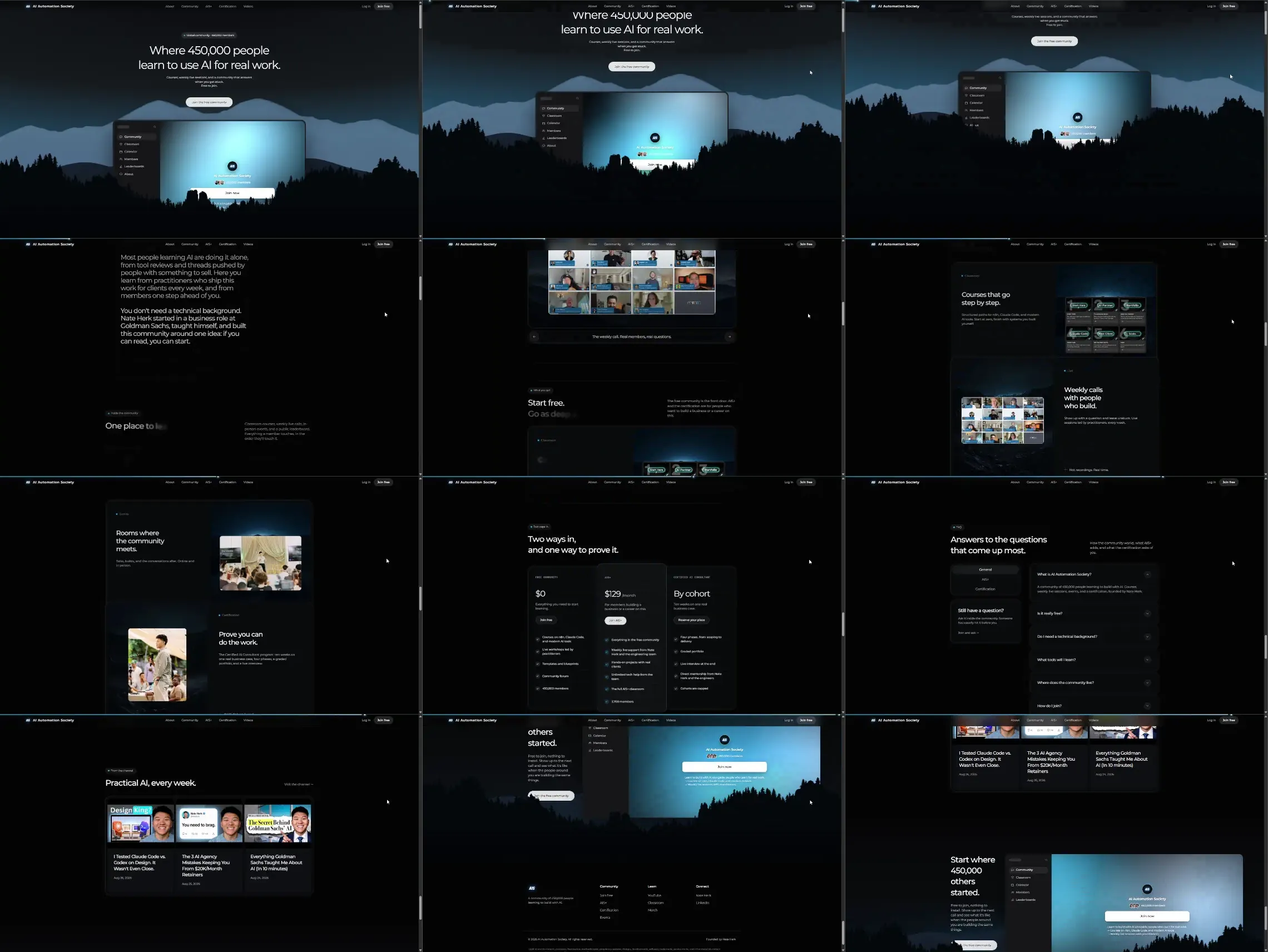
A community landing page in a single dark world. The mountain scene is the only illustration and it carries the whole feel; everything else is glassy dark cards with hairline borders and one cool accent. Copy is short and confident, section labels are small pill badges above each headline, and the same sentence shape ("Where 450,000 people learn to use AI for real work") returns at the end as "Start where 450,000 others started".
hero (scene + floating app frame), explainer (two paragraphs of dimmed long copy, no image), capability ("One place to learn": tabbed panel with a call grid), feature (the stacked deck: Courses step by step with tiled chips, Weekly calls with a call grid, Rooms with a photo, Certification with a photo, each card pinning while the next covers it), offer (three tiers: free, monthly, cohort, with check lists), faq (accordion with a side card), feature (video card row "Practical AI, every week"), closing (hero scene repeated, small), footer (four columns).
One illustration at three depths gives the page more presence than any number of stock photos would, and because it is dark the glassy cards read as lit from the scene. The dimmed-then-bright copy makes a wall of text feel like a reveal instead of a paragraph. The stacked deck turns four feature cards into one continuous motion, so the middle of the page has a set piece of its own instead of a row of equal boxes. Reusing the hero scene at the close makes the CTA feel like a return rather than a new ask. Cost to weigh: everything depends on that one scene being good; with a weak illustration the page is just dark cards.