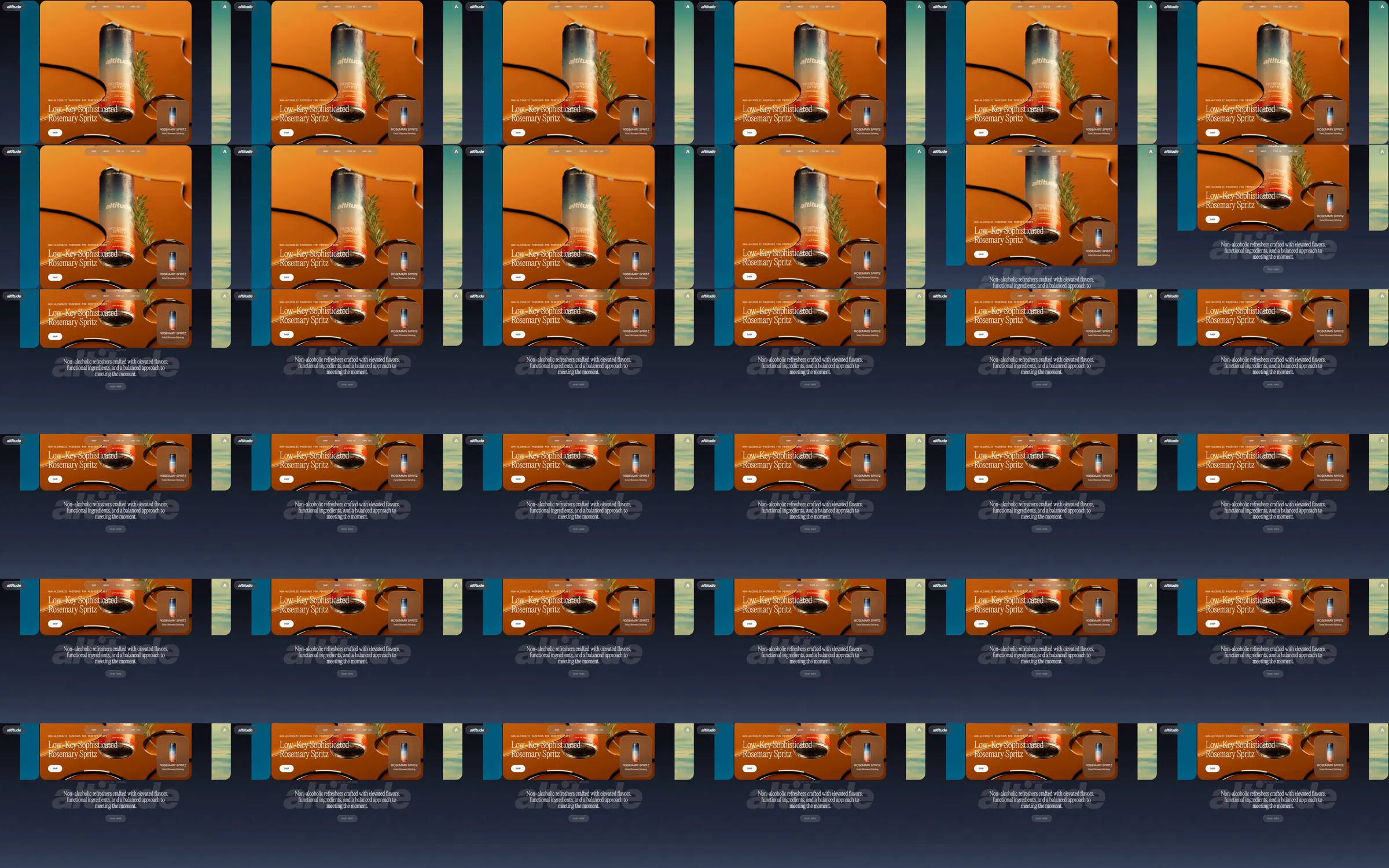
Altitude opens with an orange drink-can still life inside a large rounded panel, with neighboring flavor panels visible at the edges. Fine serif product typography, small utility navigation and a floating product-summary tile contrast with the large physical can imagery.
1. Rounded flavor-panel introduction. 2. Large can still life and product heading. 3. Small product-summary tile. 4. Short brand introduction beneath the panel.
Large can imagery makes the product unmistakable, while the neighboring panels suggest a broader flavor range. Rounded framing and fine serif labels give the still life a more editorial treatment than a conventional product-card grid.
Refero [style page](https://styles.refero.design/style/243a3dde-80a8-47a9-87f8-c549726ec6f3) and [recorded video](https://images.refero.design/styles/refero.design/video/8e00e7e9-cdb3-41c3-916a-a500ac3bd614.mp4); [live site](https://altitudebev.com/) checked on 2026-10-05. The recording is a point-in-time reference; current site content may differ. Descriptions distinguish the recording from the current page where they differ. Layout and motion notes come from sampled recording frames and automated live captures; interactive controls were not comprehensively tested. The source is an opening-focused excerpt. The current desktop page retains the rounded flavor presentation. Shop and cart links were observed but not operated; no purchase or cart change was made.