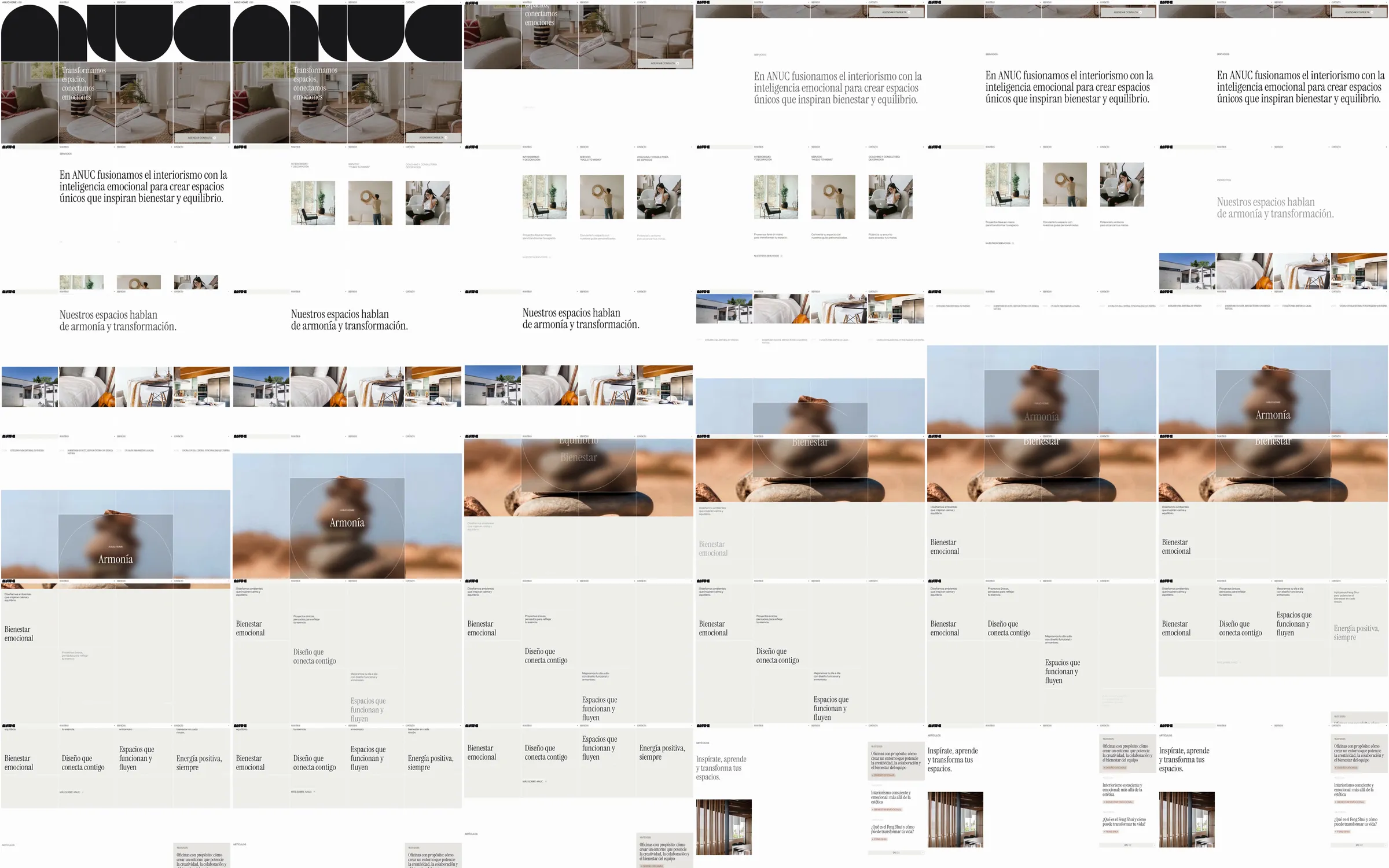
ANUC Home introduces its interior-design practice with a huge geometric wordmark over a room photograph. Quiet Spanish serif statements, small image rows and a broad ceramic still life develop an editorial narrative about space and wellbeing.
1. Oversized geometric wordmark. 2. Interior-image introduction. 3. Editorial design statement. 4. Small project and service image row. 5. Large ceramic still life. 6. Spacious design-principle explanation. 7. Lower service and contact sections.
The wordmark creates a strong visual identity before the page settles into quieter photography. Fine serif statements and generous spacing keep the interior imagery central and give the service explanation an unhurried pace.
Refero [style page](https://styles.refero.design/style/5e9409c4-d130-42f3-b224-5bd66cdfbe28) and [recorded video](https://images.refero.design/styles/refero.design/video/a5b0a8b5-00ce-46b6-8f75-1b4a7ff01f0e.mp4); [live site](https://www.anuchome.com/) checked on 2026-10-05. The recording is a point-in-time reference; current site content may differ. Descriptions distinguish the recording from the current page where they differ. Layout and motion notes come from sampled recording frames and automated live captures; interactive controls were not comprehensively tested. The current opening adds vertical divisions across the room photograph. This is an interior-design service presentation; no store, appointment booking or contact submission was exercised.