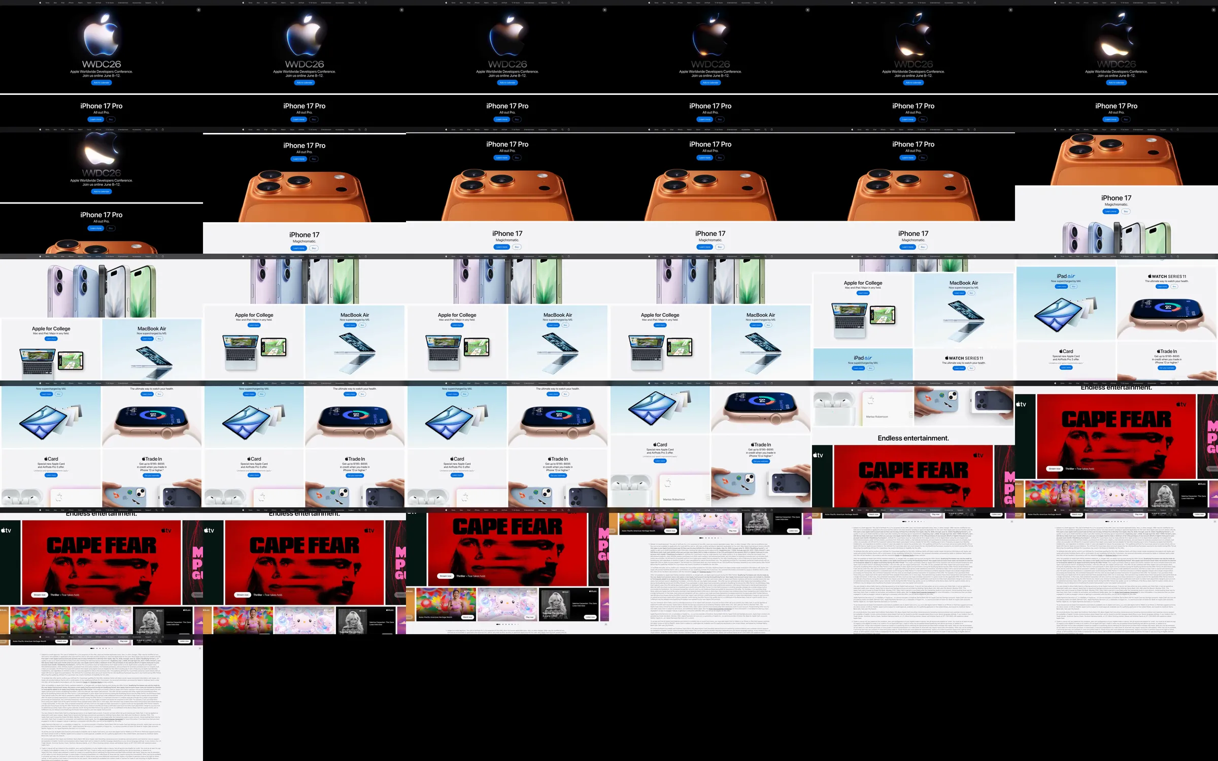
Apple's homepage sequences a small number of flagship launches as large editorial panels, then compresses the wider ecosystem into a tidy product grid and an entertainment gallery. It relies on product renders, almost no explanatory copy, and repeated paired actions to make a broad catalog feel curated.
1. Global navigation and a compact promotional ribbon. 2. Full-width dark iPhone launch hero. 3. Light iPhone Duo launch hero. 4. Dark Watch Series and Watch Ultra launch panels. 5. Compact product/service grid for AirPods, iCloud, MacBook Air, Upgrade, Card, and Trade In. 6. Entertainment gallery with carousel-style navigation, legal detail, and global footer.
Each flagship gets the visual authority of a campaign page before the catalog switches to a regular grid. The strict black/white field lets product colors carry the image, and the small blue action pills remain easy to find without competing with the hardware. The cost is that the dense legal/footer area is intentionally separated from the launch story.
The Refero Styles page supplied the 15.32-second MP4 at https://images.refero.design/styles/refero.design/video/483a5674-2b16-48aa-bd93-9c57ef728ceb.mp4. It records a WWDC26 and iPhone 17 Pro campaign state with the animated Apple mark. The live capture at https://www.apple.com/ provides the current iPhone 18 Pro, iPhone Duo, Watch Series 12, Watch Ultra 4, offer grid, entertainment gallery, measured tokens, and desktop/mobile layout. Product campaigns differ between sources; the repeated launch-panel structure is consistent.