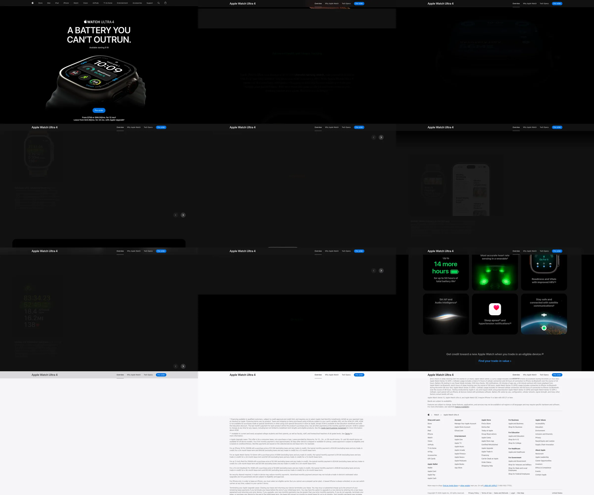
32 sections measured.
A product launch page that makes the watch itself the primary evidence. It holds almost every product story against a black field, using white upper-case display copy, occasional saturated green health data, and large close renders of the hardware. The visual rhythm moves between singular product images, dashboard screens and a final grid of smaller capabilities rather than relying on a dense comparison table.
hero (headline, availability and large watch render), feature (highlights and product viewer), capability (health tracking, readiness and heart-rate stories), feature (running metrics and battery claim), explainer (health app and Siri stories), capability (sports, adventure and on-the-go/satellite stories), offer (trade-in incentive), feature (technical comparison and environmental/value sections), footer (legal and Apple-wide navigation).
The black canvas removes visual competition, so the edge-lit watch renders and small bright data colours carry the depth. Oversized headlines create pauses between technical claims, while the repeated product silhouette makes many features feel like parts of one system. The late card grid gives breadth without breaking the single-product focus. Cost to weigh: the approach depends on exceptional proprietary photography and a recognisable physical object; without them, the large empty fields can feel underfilled.