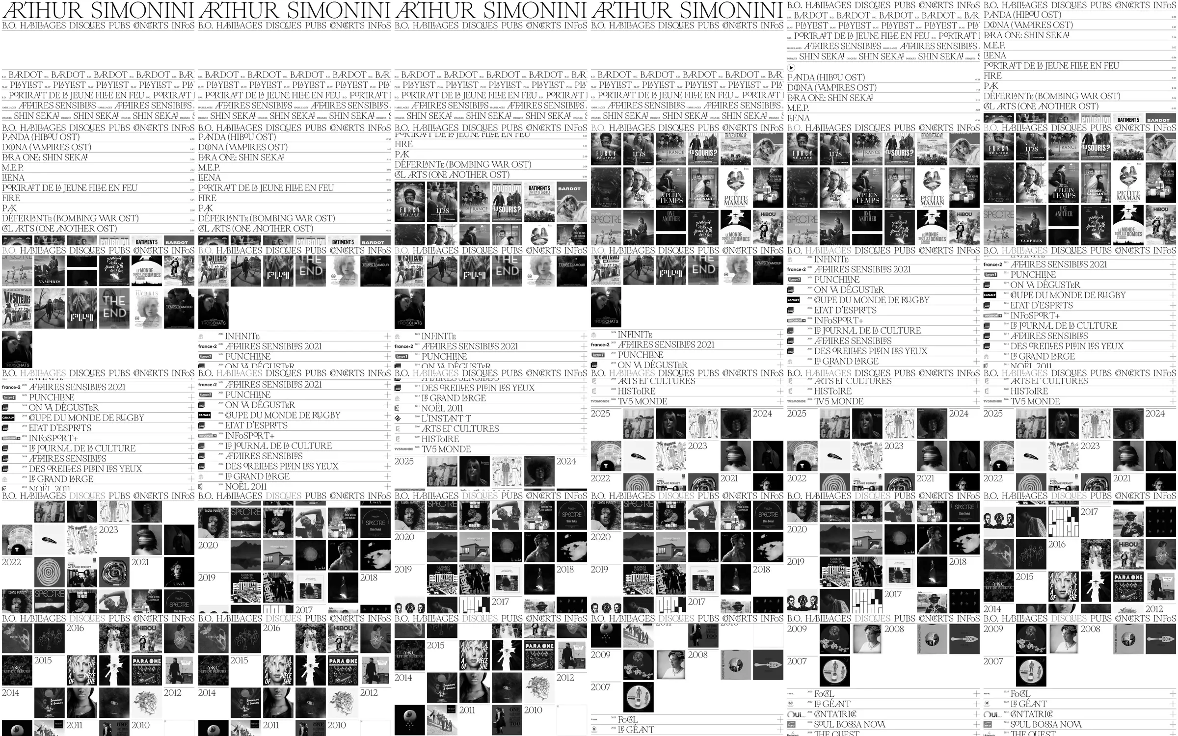
A composer's archive turns the name, navigation, and project titles into a dense serif composition. The recorded light version moves through title rows, monochrome project-cover strips, categorized credits, and a year-based image archive; the checked live version uses a black opening variant.
1. Oversized name and category navigation. 2. Repeated project-title bands. 3. Monochrome cover-image strips. 4. Categorized credit lists. 5. Year-based image archive.
Typography acts as both identity and navigation. Narrow rules and repeated text bands organize a large archive without introducing a conventional portfolio-card hierarchy.
Refero [style page](https://styles.refero.design/style/6778ff21-44eb-40f3-ba85-2ee7de935f8f) and [recorded video](https://images.refero.design/styles/refero.design/video/b250955b-340e-400c-b8b6-9abff10ac0d3.mp4); [live site](https://arthursimonini.com/) checked on 2026-10-04. The recording is a point-in-time reference; current site content may differ. Descriptions distinguish the recording from the current page where they differ. Layout and motion notes come from sampled recording frames and automated live captures; interactive controls were not comprehensively tested.