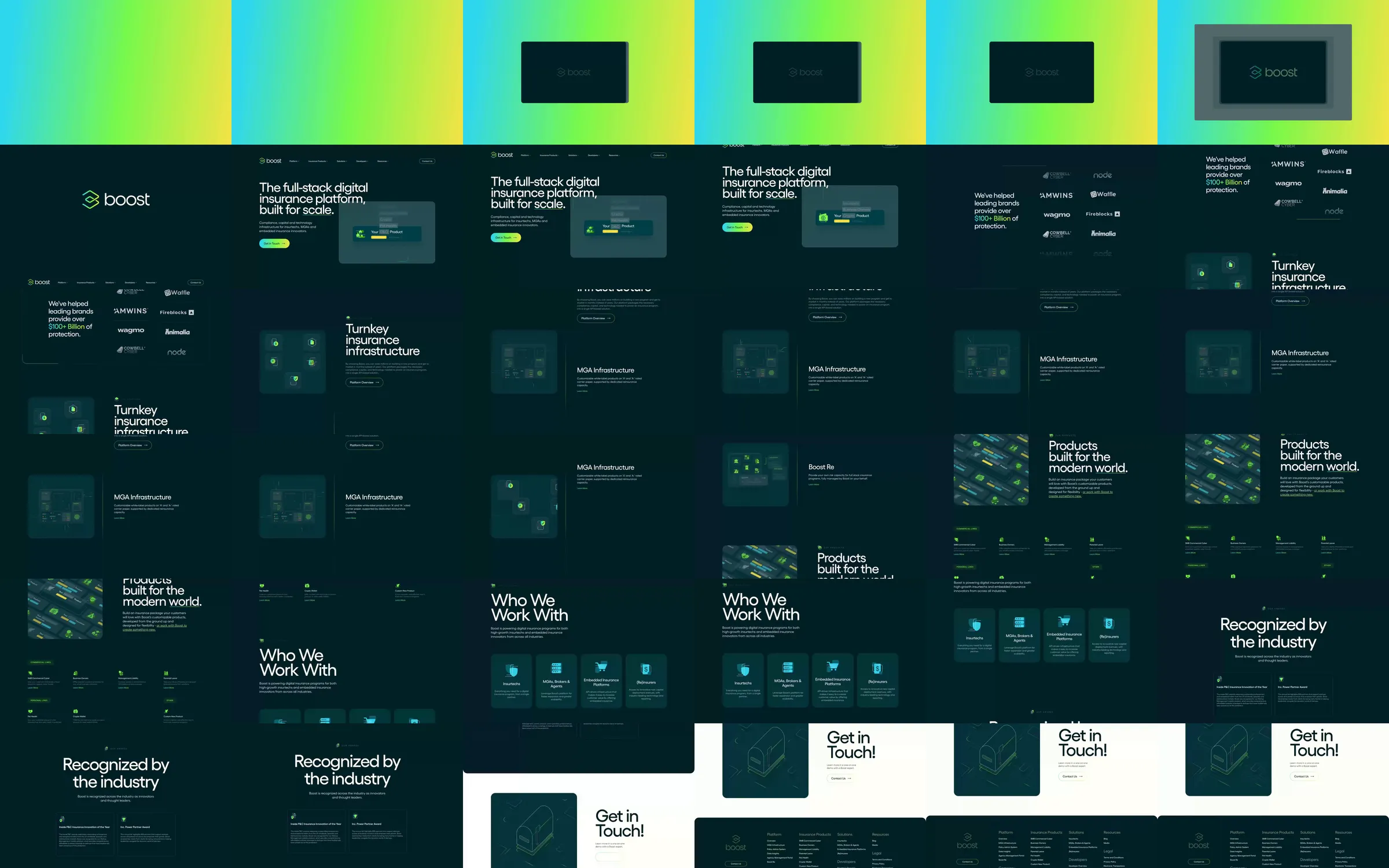
Boost combines deep teal surfaces with luminous lime accents and softly layered infrastructure diagrams. A split platform introduction leads into product and audience cards, then a pale contact section interrupts the dark page before the footer.
1. Gradient brand introduction. 2. Split insurance-platform headline. 3. Customer logo proof. 4. Infrastructure diagram rows. 5. Product card grid. 6. Audience tiles. 7. Industry recognition. 8. Pale contact section and teal footer.
The luminous accents make small infrastructure nodes readable against the dark background. Repeated diagrams connect the platform story to the more practical product cards, while the pale contact section makes the final action easy to locate.
Refero [style page](https://styles.refero.design/style/e60c61d3-2657-429e-a581-568aea27a448) and [recorded video](https://images.refero.design/styles/refero.design/video/807c94c0-825c-4898-a05f-27c0bcc4437b.mp4); [live site](https://boostinsurance.com/) checked on 2026-10-05. The recording is a point-in-time reference; current site content may differ. Descriptions distinguish the recording from the current page where they differ. Layout and motion notes come from sampled recording frames and automated live captures; interactive controls were not comprehensively tested. The recorded gradient opening is an entrance presentation that resolves into loaded page content. Insurance products, compliance claims and monetary figures were not evaluated, and no contact form was submitted.