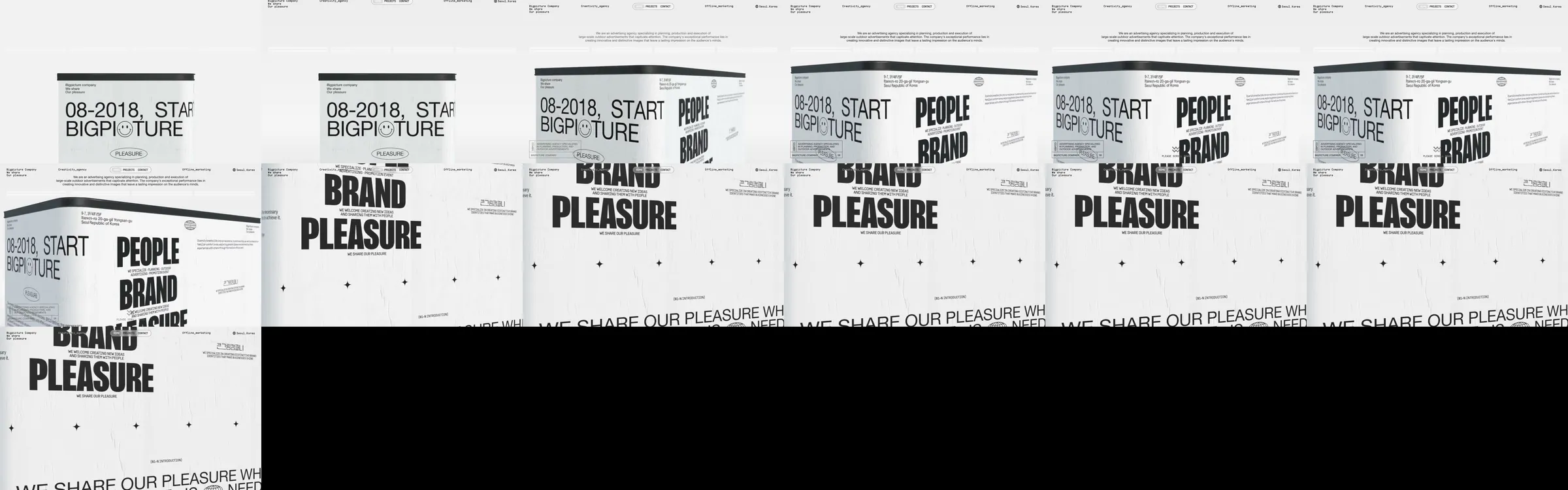
큰그림컴퍼니 introduces a creative company through a single large-format, print-inspired statement about people, brand, and pleasure.
1. Dense utility header and studio label. 2. Oversized “People / Brand / Pleasure” typographic statement with project/year markings. 3. Closing manifesto and supporting micro-copy.
The design treats the browser as a moving poster. Extreme condensed type, worn paper color, and scattered archival marks make a short message feel physical and authored.
The Refero MP4 at https://images.refero.design/styles/refero.design/video/98149e4a-2119-4f78-a19f-ec9a54a92a1c.mp4 provides the 6.5-second motion reference. The live source at https://www.bpco.kr/ yielded only a frame strip, so visual and motion notes rely chiefly on the Refero recording.