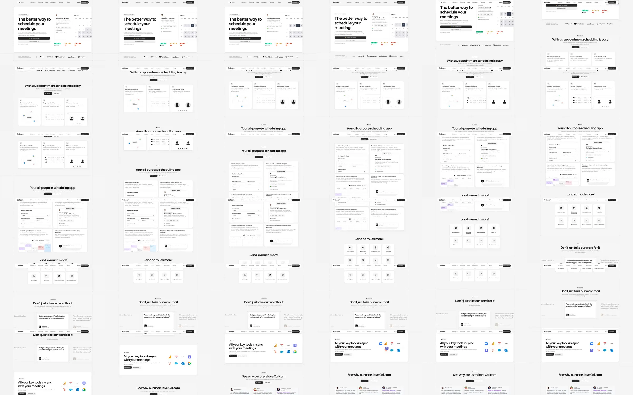
A scheduling platform landing page that demonstrates booking rather than describing it abstractly. The clear calendar surface immediately communicates the service.
1. Scheduling widget hero. 2. Booking and availability workflow. 3. Team and developer use cases. 4. Integration and customer proof. 5. FAQ and closing signup.
The large scheduling example offers instant comprehension, while restrained monochrome styling keeps many options easy to scan. The cost is a long product page that needs carefully prioritized mobile sections.
- [Refero style page](https://styles.refero.design/style/5d7aa503-8cfa-49a4-bd3b-0c2f0f075c70) and its [recorded MP4](https://images.refero.design/styles/refero.design/video/62376fb4-97d6-4ebc-b2a8-09ffa697ec78.mp4) supply the sampled motion and section sequence. - The live capture at https://cal.com/ supplies current copy, responsive screenshots, and measured layout. - The live site closely follows the recorded scheduling system. Use the recording for widget-state transitions and the live page for current integrations.