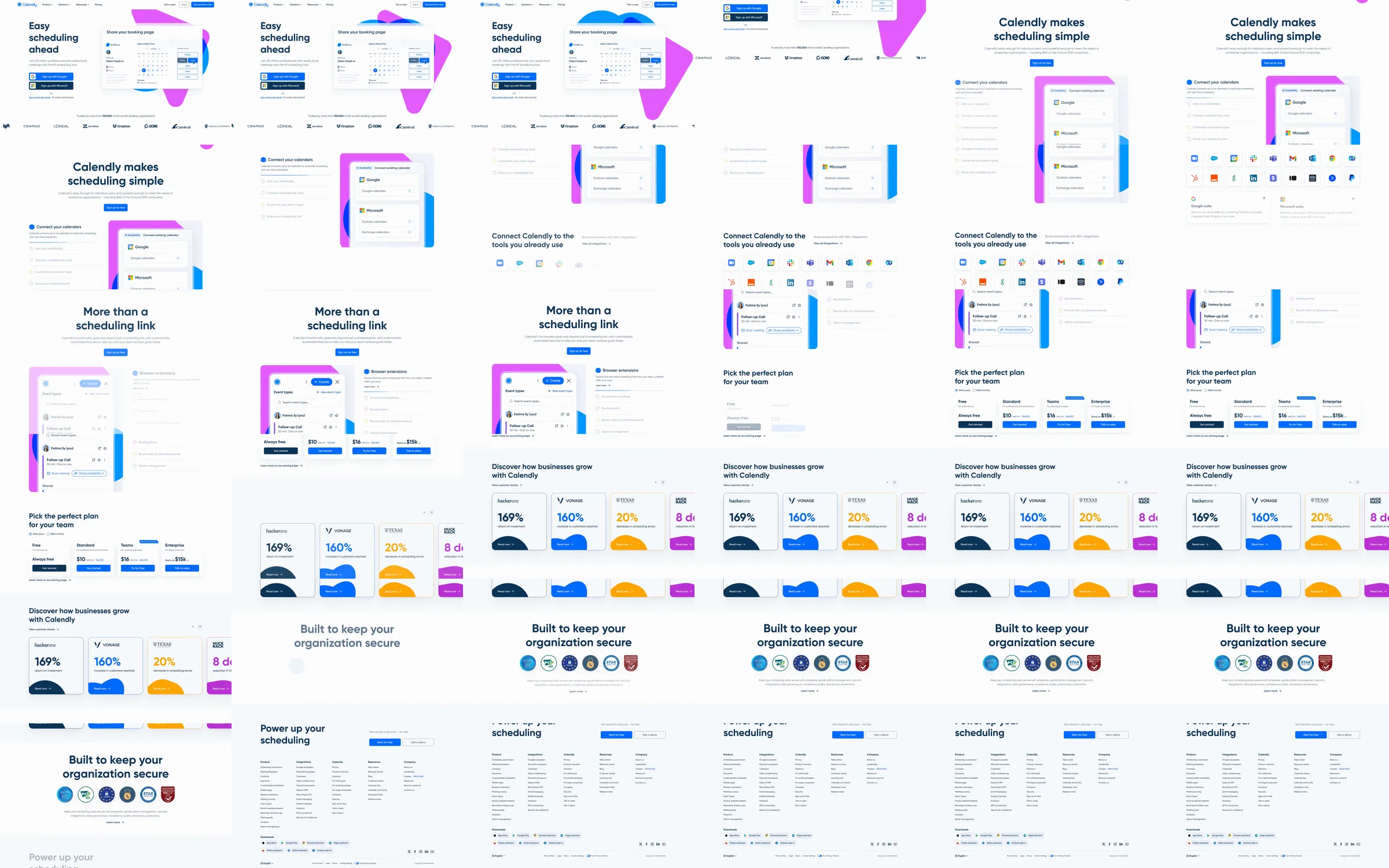
A product-led scheduling landing page that turns an abstract promise—less work around meetings—into a sequence of recognizable UI moments. It balances friendly color, compact copy, and concrete workflow demonstrations so the breadth of the platform stays approachable.
1. Utility announcement, compact navigation, sign-in, and free-start actions. 2. Outcome-led hero with account sign-up choices and a large scheduling-product demonstration. 3. Meeting-management promise with a four-part book, prep, capture, and follow-up model. 4. Feature walkthroughs pairing short explanations with gradient-backed interface cards. 5. Automated recaps, conversational scheduling, and workflow capability panels. 6. Customer proof and integration ecosystem. 7. Closing conversion prompt and deep navy sitemap footer.
The page repeatedly anchors benefits in small, legible pieces of product UI, while pale surfaces and blue-to-pink gradients soften a potentially administrative category. Clear headings, limited copy, and generous vertical spacing keep the long capability story easy to scan. The cost is that repeated white sections and pastel demonstrations depend on precise pacing and contrast to avoid feeling washed out.
- [Refero style page](https://styles.refero.design/style/9946887b-ffa9-4276-af81-ae6352795afb) and its [recorded MP4](https://images.refero.design/styles/refero.design/video/861ee373-0add-466f-845e-47296e9e4d20.mp4) supply the earlier full-page sequence, integration reveal, plan comparison, proof cards, and footer transition. - The live capture at https://calendly.com/ supplies the current gradient-led redesign, AI scheduling story, responsive screenshots, and measured layout. - The sources differ substantially in visual treatment and section order. Trust the live page for current content and design; trust the Refero recording only for the earlier page's complete scroll sequence.