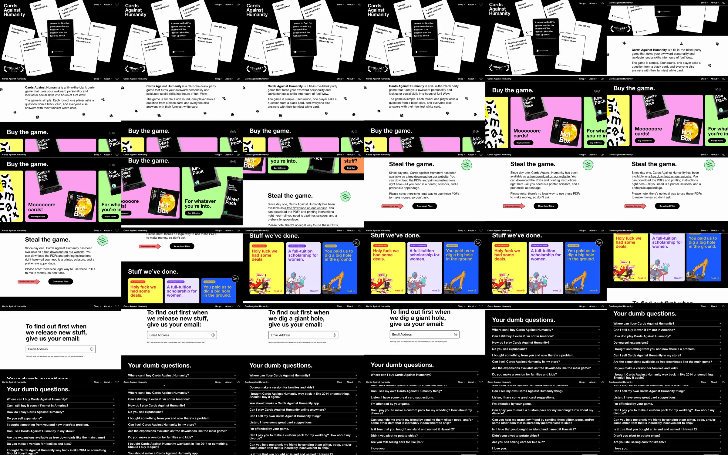
A game storefront begins with oversized black-and-white cards and moves through playful boxed-product offers and FAQ copy.
1. Card-game identity hero. 2. Buy-the-game product tiles. 3. Related game and novelty offers. 4. Blunt FAQ and footer.
The typography matches the brand voice and makes each product offer unmistakable despite the deliberately chaotic tone.
Refero [style page](https://styles.refero.design/style/51b5d80e-d898-4d70-bd16-9e50406e014c) and [recorded video](https://images.refero.design/styles/refero.design/video/6827b45e-5628-4f2b-9e19-f22e73a6c47c.mp4); [live site](https://www.cardsagainsthumanity.com/) checked on 2026-09-25. The recording is a point-in-time reference; current site content may differ. Motion and layout notes come from sampled frames and an automated live capture, not interaction testing.