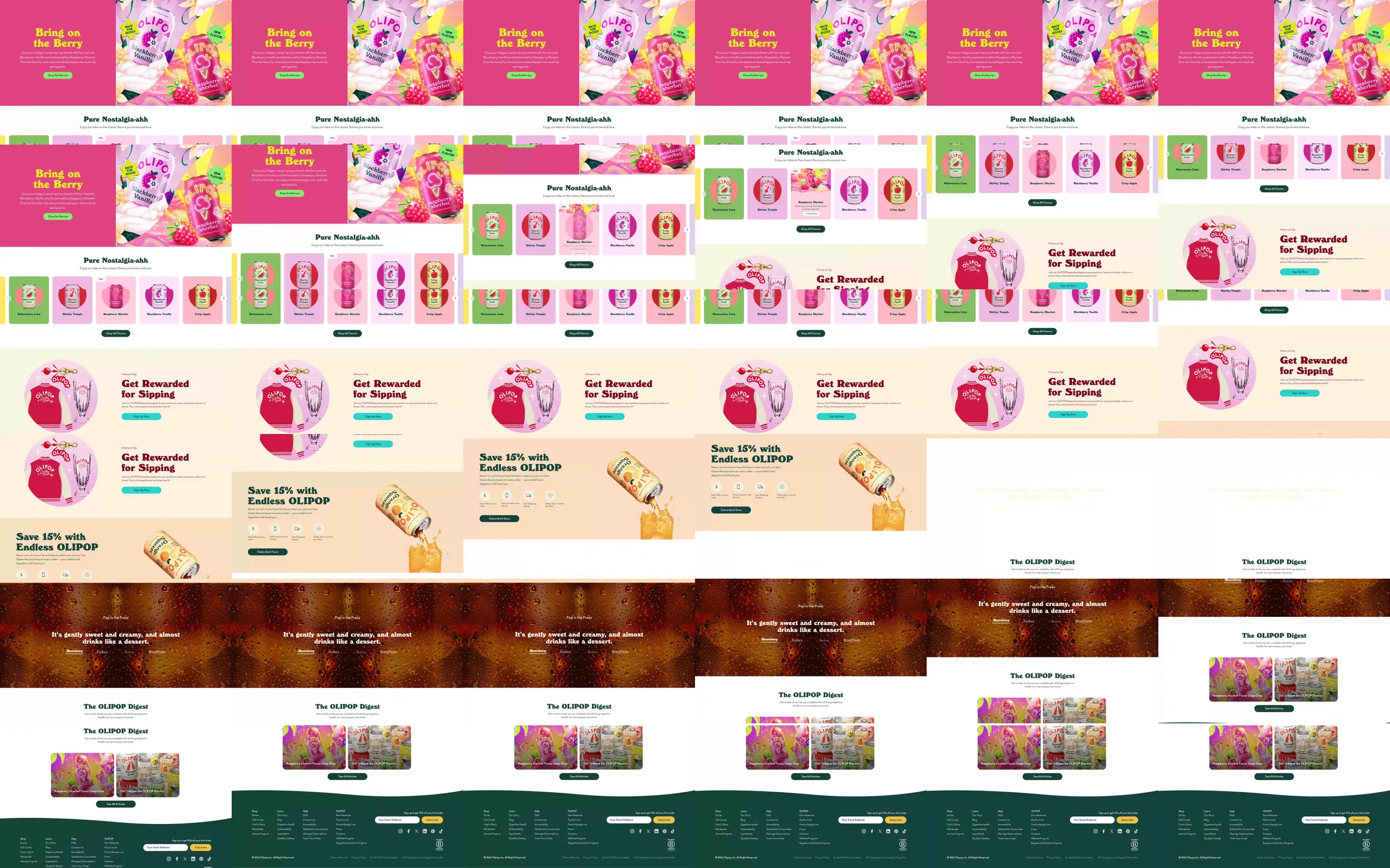
A pink berry campaign divides the opening between a large serif statement and a can photograph. Cream catalog rows place colorful cans against pink and green backdrops. Pink rewards and a peach subscription panel lead into a liquid-text band, editorial digest cards and a green footer.
1. Pink berry campaign introduction. 2. Cream flavor and can collections. 3. Pink rewards panel. 4. Peach subscription panel. 5. Liquid-text band. 6. Editorial digest cards. 7. Green footer.
Color ties each flavor to a recognizable scene while the cream catalog keeps the products easy to scan. The playful serif statements and liquid imagery carry the beverage identity into the subscription and editorial sections.
Refero [style page](https://styles.refero.design/style/c6ec55c7-0bd9-47c5-a4d2-669b7790c9cc) and [recorded video](https://images.refero.design/styles/refero.design/video/92c10b36-e993-4d2c-ac75-1c04c787e3cc.mp4); [live site](https://drinkolipop.com) checked on 2026-10-06. The recording is a point-in-time reference; current site content may differ. Descriptions distinguish the recording from the current page where they differ. Layout and motion notes come from sampled recording frames and automated live captures; interactive controls were not comprehensively tested. The current pink campaign features Pomegranate Sparkle rather than the recorded berry promotion. Offers and product availability in the recording are historical.