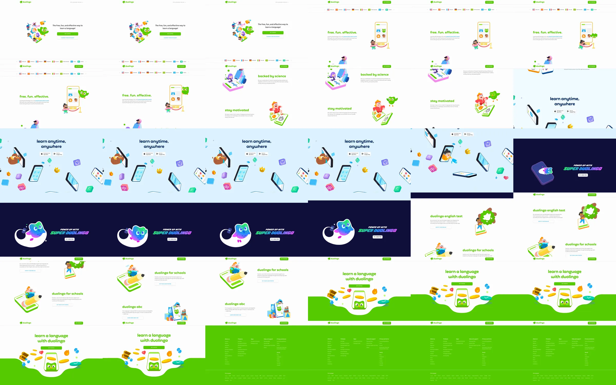
Duolingo introduces language learning through a bright, illustration-led product story. It pairs simple benefits with expressive characters, small device scenes, a premium-plan interruption, test and school offers, then a large green conversion close.
1. Minimal header, language selector, and a hero with a character cluster, short promise, and two actions. 2. “Free. fun. effective.” overview with a phone and progress illustration. 3. Science, motivation, and personalized-learning chapters, each paired with a distinct character vignette. 4. Pale-blue “learn anytime, anywhere” app/download scene with phones and floating icons. 5. Deep-indigo Super Duolingo offer break. 6. English-test, schools, and ABC product offers. 7. Large green language-learning close and an extensive multi-column footer.
The page makes an education product feel low-pressure by keeping each idea to a short, friendly headline and one memorable illustration. White space gives the saturated green room to work as the action color, while the pale-blue and indigo chapters make the long page easy to navigate. The repeated mascot world gives many product offers one coherent voice.
The Refero Styles page supplied the 37.62-second MP4 at https://images.refero.design/styles/refero.design/video/b8a0d888-eae3-45f1-9ef1-dc4e56c66aef.mp4. It provides the longer illustrated sequence, chapter hand-offs, and Super Duolingo treatment. The live capture at https://duolingo.com/ records the current desktop and mobile layouts, measured Duolingo Sans stack and color tokens, plus the current navigation and footer. Both sources show the same core marketing structure.