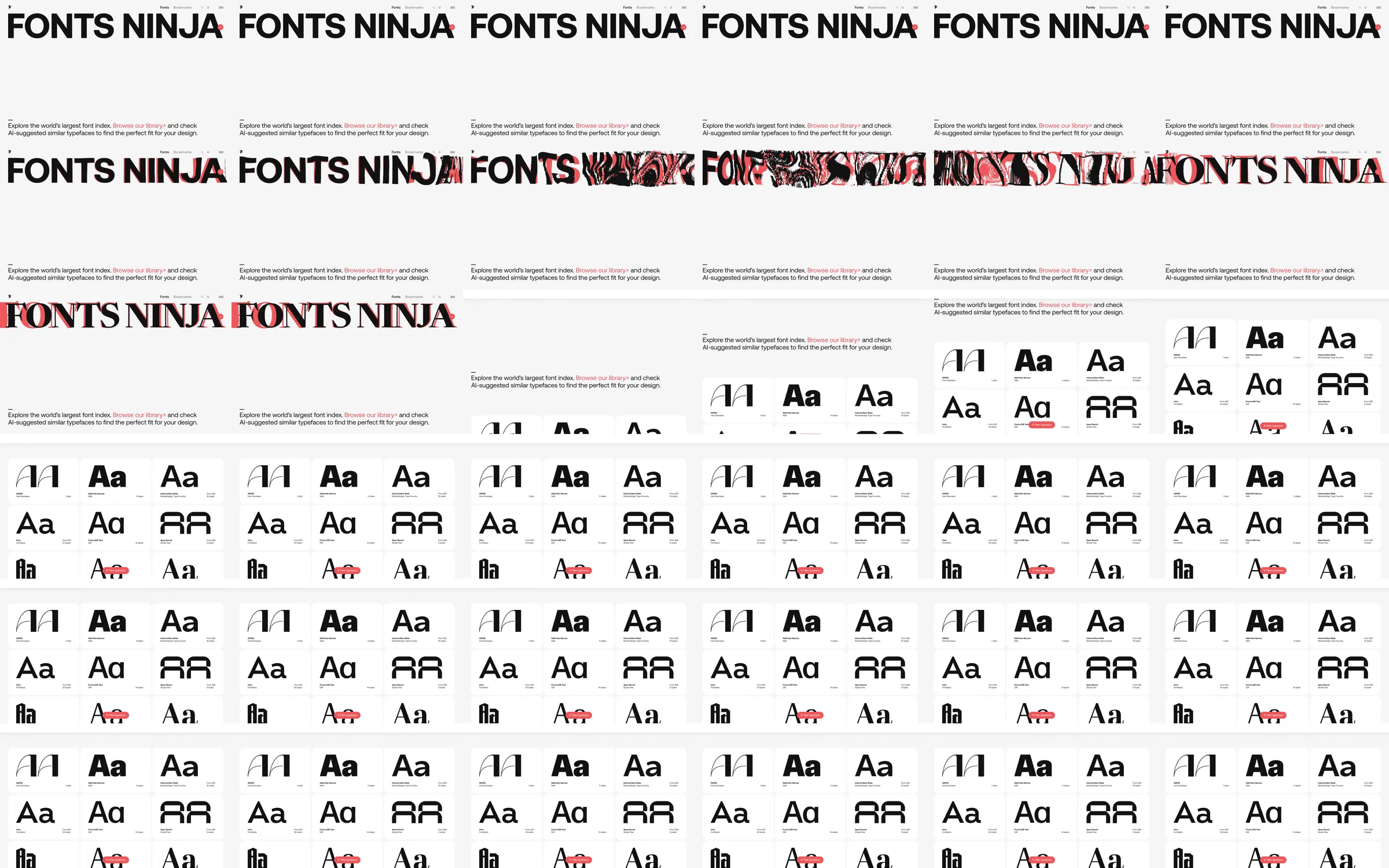
Recording-only reference. Huge Fonts Ninja lettering spans a pale page. Red-black distorted textures move through the letters before a brief explanation leads into a tightly organized grid of contrasting font specimens.
1. Oversized brand lettering. 2. Red-black typographic distortion. 3. Short font-discovery explanation. 4. Multi-row font-specimen grid.
The animated lettering demonstrates typographic variety before the specimen grid makes that variety easy to compare. Very small labels and a pale canvas keep the letterforms as the main content.
Refero [style page](https://styles.refero.design/style/86de6781-d22b-4879-90df-44acb1fe20f3) and [recorded video](https://images.refero.design/styles/refero.design/video/33a78428-e60d-41a7-be8e-5f2bd8887290.mp4); [live site](https://fonts.ninja) checked on 2026-10-07. The recording is a point-in-time reference; current site content may differ. Descriptions distinguish the recording from the current page where they differ. Layout and motion notes come from sampled recording frames; no live capture or measured responsive layout is attached; interactive controls were not comprehensively tested. The live site refused automated access with HTTP403. The source ends within the specimen catalog; no blocked image or live measurement is attached.