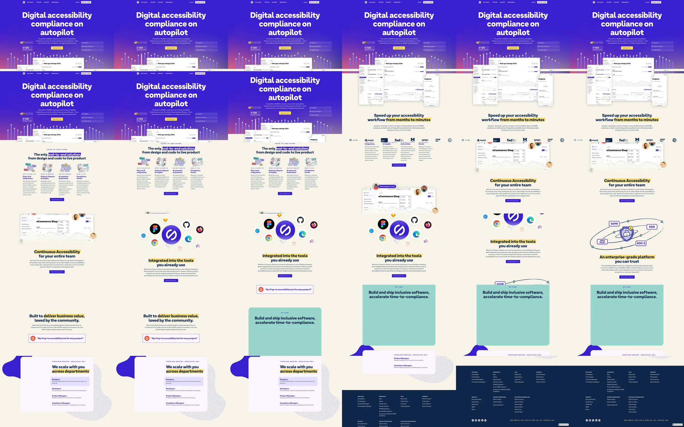
An accessibility platform leads with a vivid purple statement and layered software panels. Cream sections explain workflow, integrations, and enterprise coordination using small interface examples, circular service marks, and diagrammatic illustrations, with pale-yellow and mint emphasis regions.
1. Purple accessibility proposition and layered interface hero. 2. Workflow explanation and product panels. 3. Continuous accessibility region. 4. Tool-integration marks. 5. Enterprise coordination diagram. 6. Mint value statement. 7. Department-specific information and navy footer.
The sharp purple-to-cream transition separates the promise from the explanation. Diagrams and small interface examples make a broad organizational workflow concrete while maintaining a playful but structured product identity.
Refero [style page](https://styles.refero.design/style/ea9c37e8-c56c-42aa-8e81-9b55222a5cd3) and [recorded video](https://images.refero.design/styles/refero.design/video/612b6598-24e6-4087-8bd5-0eb9c7539e40.mp4); [live site](https://www.getstark.co/) checked on 2026-10-04. The recording is a point-in-time reference; current site content may differ. Descriptions distinguish the recording from the current page where they differ. Layout and motion notes come from sampled recording frames and automated live captures; interactive controls were not comprehensively tested.