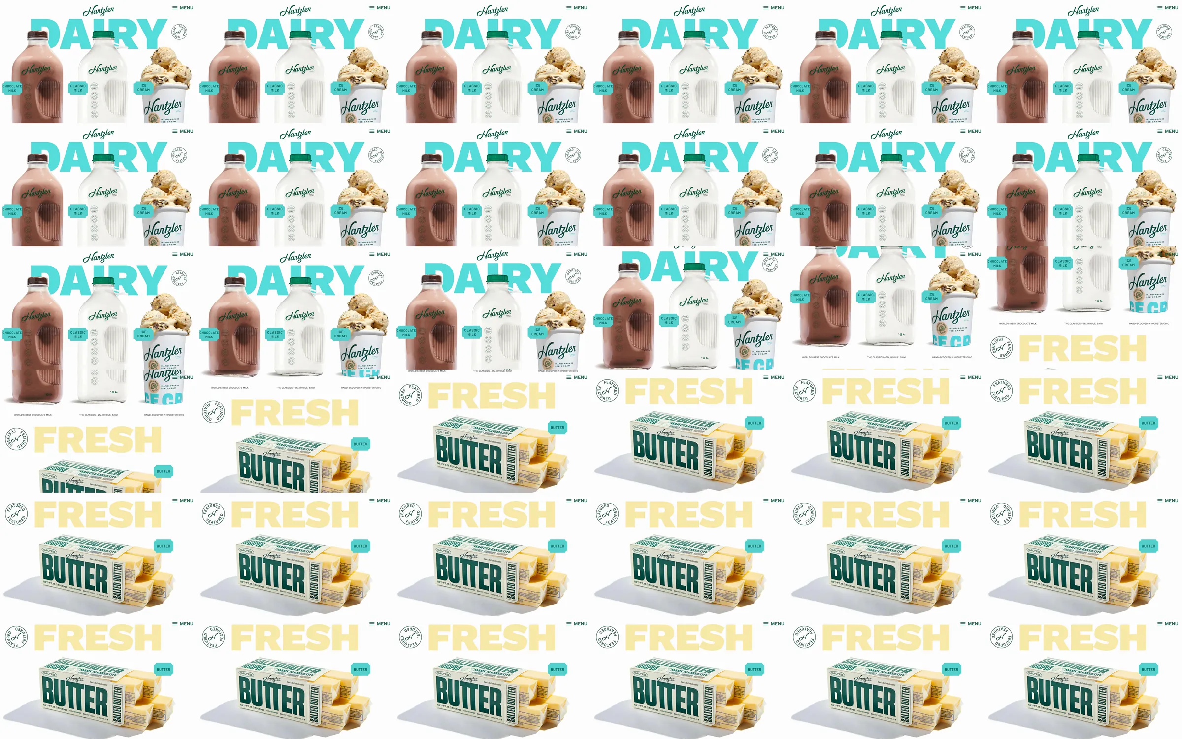
A family dairy site that uses close-up packaging as the principal visual language for its product families.
1. Oversized dairy product hero. 2. Milk and ice-cream categories. 3. Fresh butter product stage. 4. Shop and contact navigation.
Packaged products read instantly against the broad white field; the cost is that navigation and brand history are easy to miss beside the giant imagery.
- [Refero style page](https://styles.refero.design/style/14efe0a8-5abf-441c-919d-add271317bf9) and its [recorded MP4](https://images.refero.design/styles/refero.design/video/3d8f3b5f-e79c-4a33-af07-da14ebd6fe46.mp4) supply the sampled motion and section sequence. - The live page at https://www.hartzlerdairy.com/ was checked for its current content, responsive screenshots, and measured layout. - The live first viewport matches the product hero; the short recording provides the visible shift into butter.