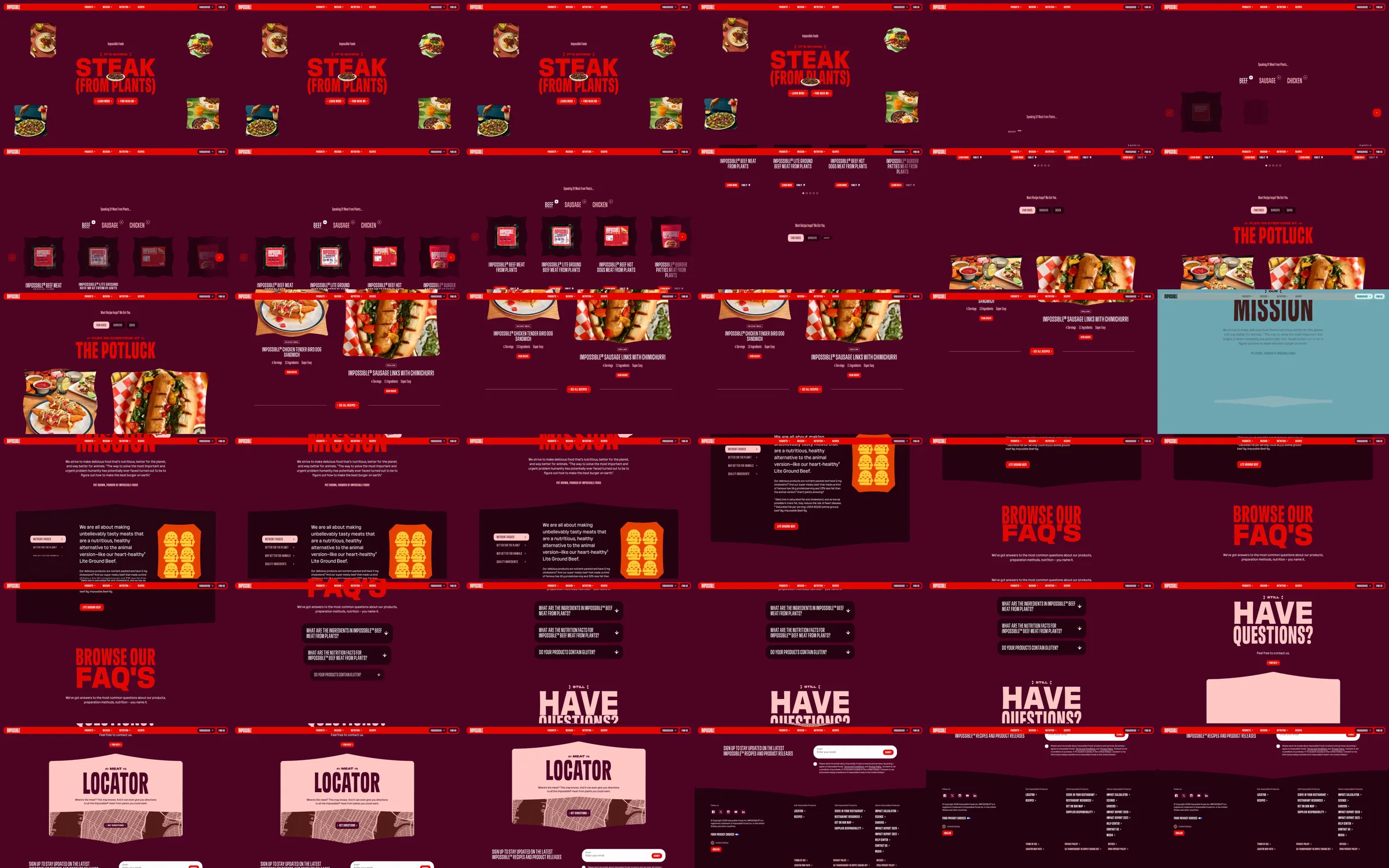
Recording-only reference. Red condensed typography and isolated food photographs fill a deep burgundy introduction. A compact product lineup leads into a Potluck recipe presentation and a contrasting mission panel. Dark text cards, FAQs and a pink locator illustration continue the story before the burgundy footer.
1. Burgundy food introduction. 2. Compact product lineup. 3. Potluck recipe presentation. 4. Contrasting mission panel. 5. Dark explanatory cards. 6. FAQ rows. 7. Pink locator illustration. 8. Burgundy footer.
The warm food photography and forceful red lettering give the page a recognizable appetite-driven identity. Pale pink and cooler mission surfaces provide relief from the otherwise saturated palette.
Refero [style page](https://styles.refero.design/style/04961c7d-8ca6-4e87-ba88-6ad7ffa3b245) and [recorded video](https://images.refero.design/styles/refero.design/video/8023132a-a21f-44ba-b10f-fea831ef928e.mp4); [live site](https://impossiblefoods.com/) checked on 2026-10-06. The recording is a point-in-time reference; current site content may differ. Descriptions distinguish the recording from the current page where they differ. Layout and motion notes come from sampled recording frames; no live capture or measured responsive layout is attached; interactive controls were not comprehensively tested. The live page displayed a Cloudflare blocked screen with HTTP 403; no blocked-screen image is retained. The recorded lineup is presented as catalog inspiration rather than a tested checkout flow.