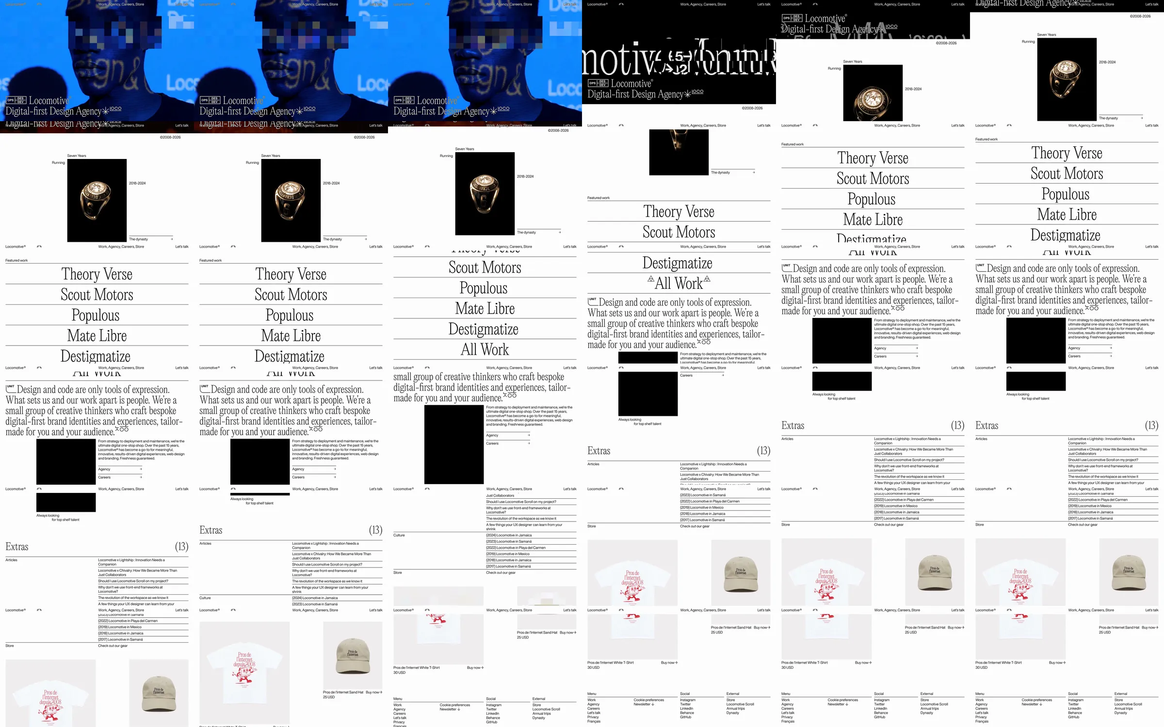
A digital agency moves from a bold film-and-type introduction into a spare white work index with giant serif project names and a compact agency statement.
1. Animated digital-agency identity. 2. Award and featured-work presentation. 3. Agency statement and project index. 4. Editorial extras, merchandise and contact.
The shift from the expressive opening to a ruled typographic index makes both the agency personality and its body of work easy to recognize.
Refero [style page](https://styles.refero.design/style/131d07b0-f71b-4bd2-8046-f61485ed545c) and [recorded video](https://images.refero.design/styles/refero.design/video/d9691ab9-e83b-4ee6-861c-de7f374fc5ab.mp4); [live site](https://locomotive.ca/) checked on 2026-10-01. The recording is a point-in-time reference; current site content may differ. Motion and layout notes come from sampled frames and an automated live capture, not interaction testing. Featured projects vary between the recording and current live site. Pointer-specific effects were not interaction-tested.