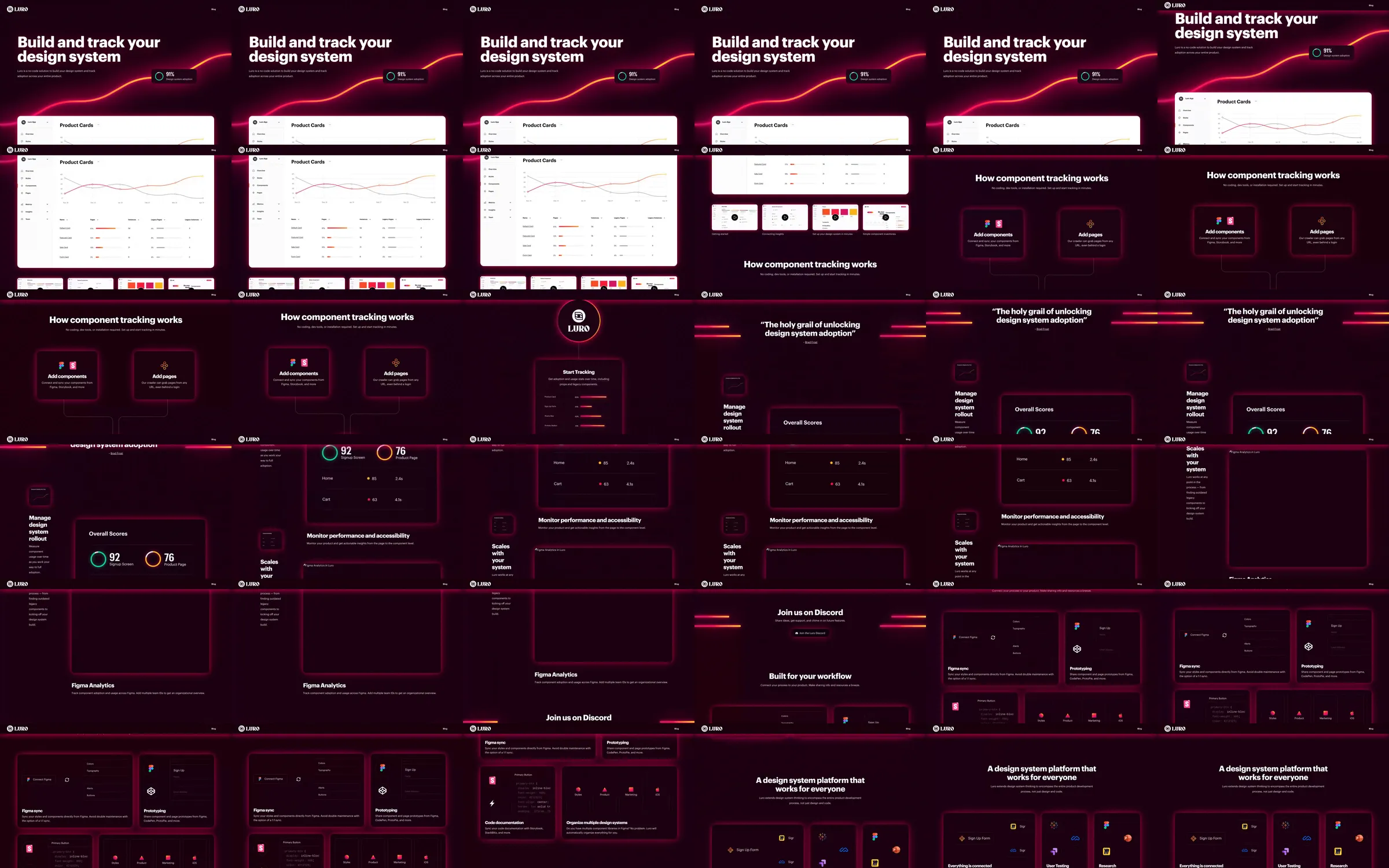
Luro uses a deep burgundy background, a luminous orange-pink curve and a bright analytics panel to introduce design-system adoption tracking. Compact process diagrams and dark feature cards continue the same neon system through performance, integrations and the closing statement.
1. Dark headline and adoption curve. 2. White analytics panel. 3. Component and page tracking steps. 4. Connected tracking diagram. 5. Performance and adoption cards. 6. Workflow integrations. 7. Closing platform statement.
The bright curve immediately establishes the analytics theme, while the white interface panel provides a readable point of contrast. Repeating luminous lines across darker cards keeps the more technical explanation visually connected.
Refero [style page](https://styles.refero.design/style/4e10797e-03eb-4efb-a16d-1d93272e1cab) and [recorded video](https://images.refero.design/styles/refero.design/video/8ebc7b75-dd72-4161-88e4-8bc44e524111.mp4); [live site](https://luroapp.com/) checked on 2026-10-05. The recording is a point-in-time reference; current site content may differ. Descriptions distinguish the recording from the current page where they differ. Layout and motion notes come from sampled recording frames and automated live captures; interactive controls were not comprehensively tested. The live opening retains the curve and analytics composition. Component imports, URL crawling and integrations were not configured; displayed adoption and performance figures are presentation content.