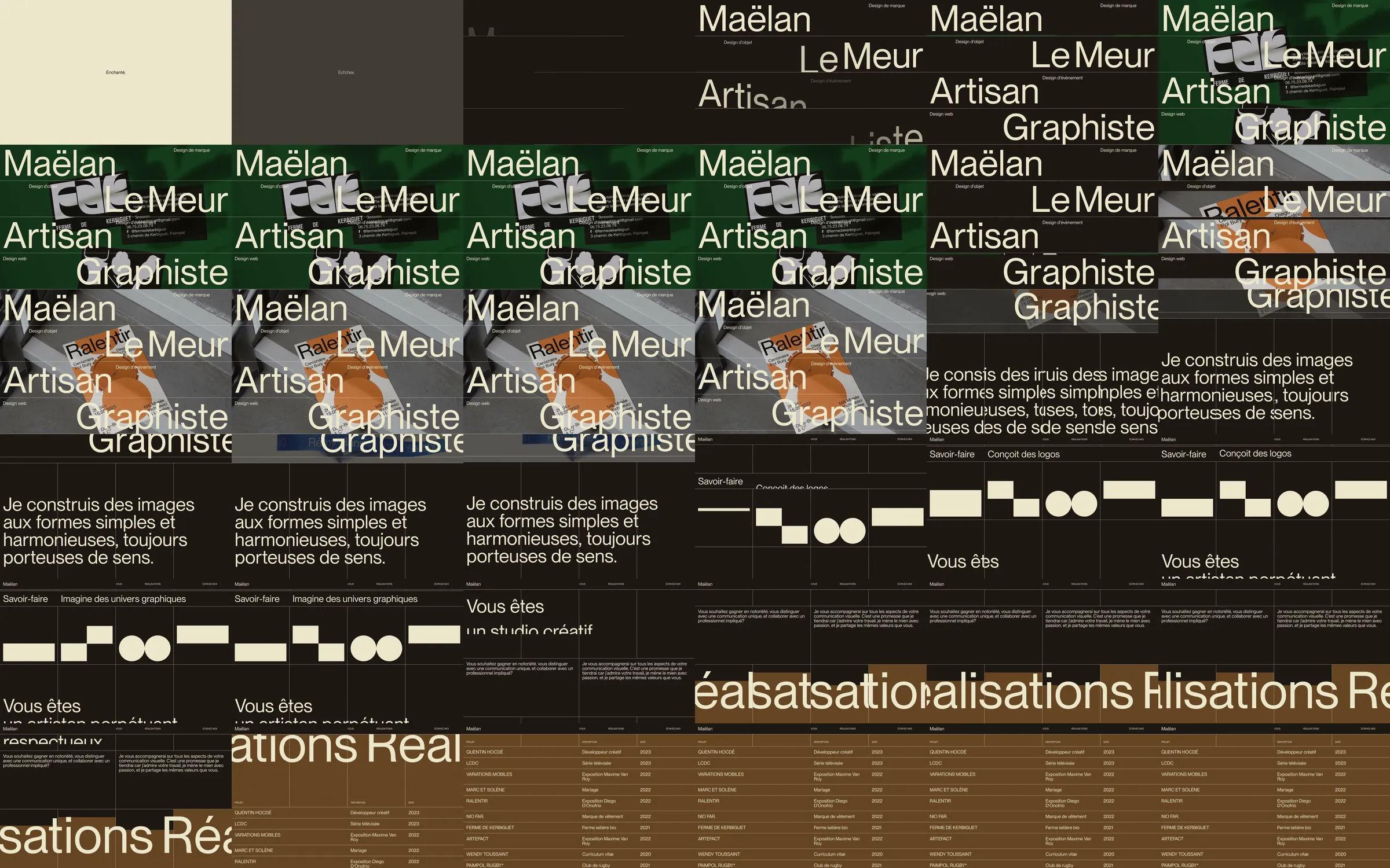
A graphic designer's portfolio uses cream lettering, a dark brown canvas and a fine ruled structure. The name and occupation span multiple large lines over design photographs. Introductory copy gives way to geometric service symbols, client categories and a large project index, making the typography itself a central exhibit.
1. Greeting and oversized identity entrance. 2. Layered work imagery. 3. Repeated studio statement. 4. Geometric service symbols. 5. Client-category introduction. 6. Large project index. 7. Contact links.
Large lettering and a strict ruled framework create a recognizable visual signature. The restrained brown-and-cream palette lets changing work imagery sit behind the text while the geometric service strip provides a second distinct visual rhythm.
Refero [style page](https://styles.refero.design/style/ea0d7b5a-c887-4b6b-9260-6ca4d1fd7caa) and [recorded video](https://images.refero.design/styles/refero.design/video/bb7a10db-7dde-42d7-b234-3dc7b52d96a7.mp4); [live site](https://maelanlemeur.com/) checked on 2026-10-06. The recording is a point-in-time reference; current site content may differ. Descriptions distinguish the recording from the current page where they differ. Layout and motion notes come from sampled recording frames and automated live captures; interactive controls were not comprehensively tested. The entrance required a longer settling period. The mobile capture preserves the site's rotated-column composition rather than treating it as a conventional stacked hero.