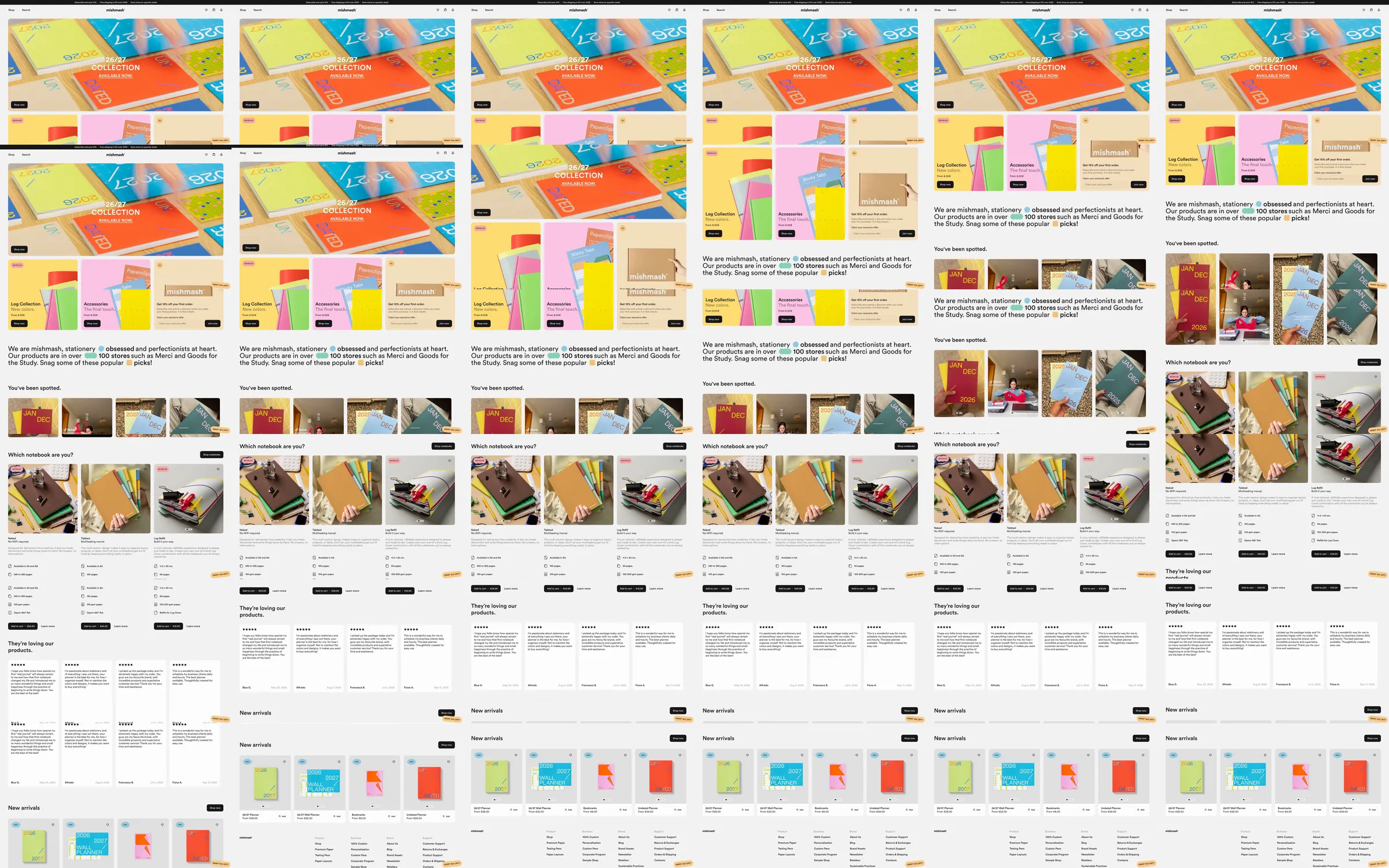
A bright stationery campaign leads into large pastel product panels, a short brand statement and image-led product comparisons. Spare specification columns and customer quotations sit between lifestyle photography and a row of new arrivals.
1. Colorful campaign hero. 2. Large stationery panels. 3. Brand statement. 4. Lifestyle examples. 5. Product comparisons and specifications. 6. Customer quotations. 7. New arrivals.
The stationery colors provide the palette directly; quieter comparison columns give practical detail a clear place within the playful shopping narrative.
Refero [style page](https://styles.refero.design/style/ebac84e6-b22c-4d21-845f-9165158af844) and [recorded video](https://images.refero.design/styles/refero.design/video/1d83e418-ce03-410b-a7dd-5d43dee53524.mp4); [live site](https://mishmash.pt/) checked on 2026-10-05. The recording is a point-in-time reference; current site content may differ. Descriptions distinguish the recording from the current page where they differ. Layout and motion notes come from sampled recording frames and automated live captures; interactive controls were not comprehensively tested. The current campaign promotes Back to Routine with updated stationery; the recording contains an earlier collection.