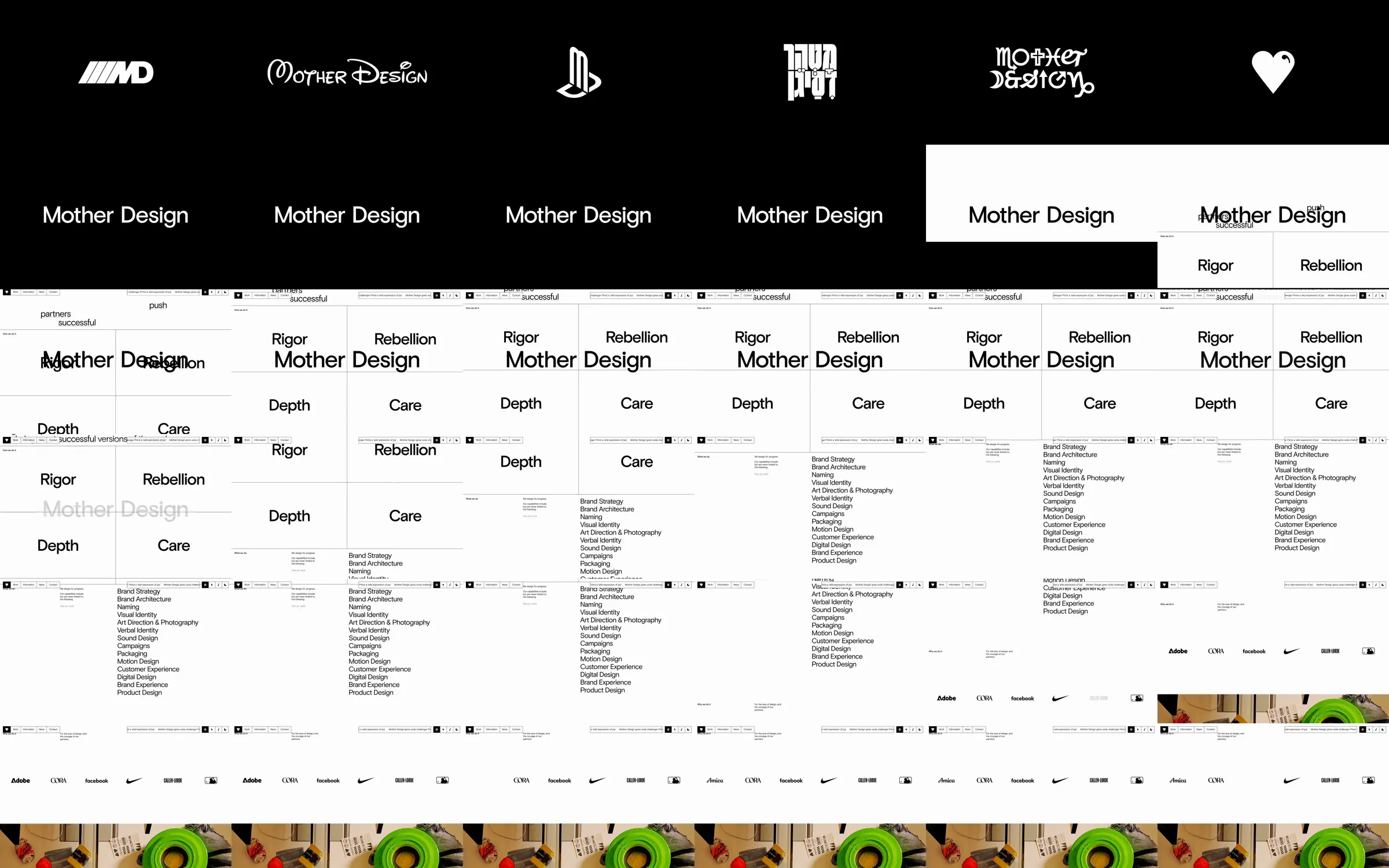
The recorded introduction cycles through white logo variants on black, then opens into a ruled white layout of studio values, capabilities, client names, and project imagery.
1. Logo-variation introduction. 2. Studio values grid. 3. Capabilities list. 4. Client names. 5. Project image band.
The shifting identity demonstrates the studio’s range before the ruled grid supplies an orderly account of its services.
Refero [style page](https://styles.refero.design/style/f40e6a6c-1704-407a-b21b-6141fb90adfe) and [recorded video](https://images.refero.design/styles/refero.design/video/9c201fb9-092f-422b-ae55-d9618e128bae.mp4); [live site](https://www.motherdesign.com/) checked on 2026-10-04. The recording is a point-in-time reference; current site content may differ. Descriptions distinguish the recording from the current page where they differ. Layout and motion notes come from sampled recording frames and automated live captures; interactive controls were not comprehensively tested. The current homepage opens with a horizontally arranged project strip and a utility-like navigation frame.