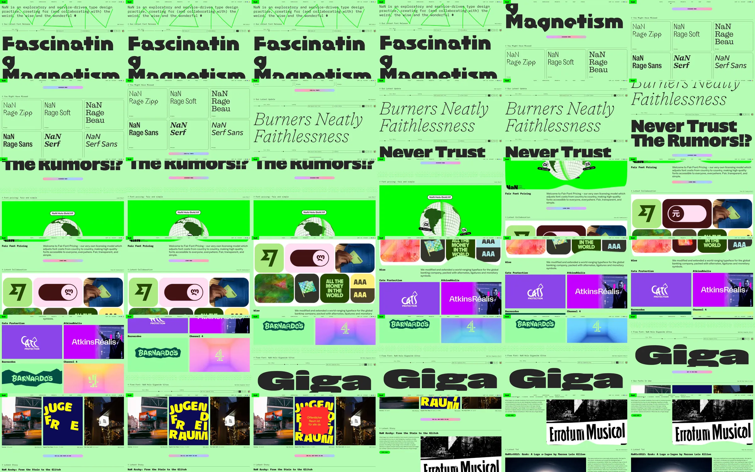
A vivid green type-foundry page combines a short studio statement with oversized specimen words, font-family rows and tiny technical controls. The browse mixes giant letterforms with saturated identity-project mosaics, showing both purchasable type and the contexts in which the fonts are used.
1. Foundry statement and font release controls. 2. Oversized type specimen. 3. Font-family comparison rows. 4. Secondary giant specimen and feature example. 5. Colorful identity project mosaics. 6. Further font and project examples. 7. Foundry and shop navigation.
The product demonstrates itself through the typography of the page. Small technical labels make the oversized specimens feel like tools, while identity mosaics explain the commercial and cultural range of the work.
Refero [style page](https://styles.refero.design/style/71db2a51-118e-42b1-879d-29872d52142f) and [recorded video](https://images.refero.design/styles/refero.design/video/bb04a5b3-899c-44eb-b213-74723b457c5c.mp4); [live site](https://www.nan.xyz/) checked on 2026-10-05. The recording is a point-in-time reference; current site content may differ. Descriptions distinguish the recording from the current page where they differ. Layout and motion notes come from sampled recording frames and automated live captures; interactive controls were not comprehensively tested. The current opening highlights NaN Gothic and the words Little Flying; the recorded opening uses a different specimen. Neither shopping checkout nor font licensing controls were exercised.