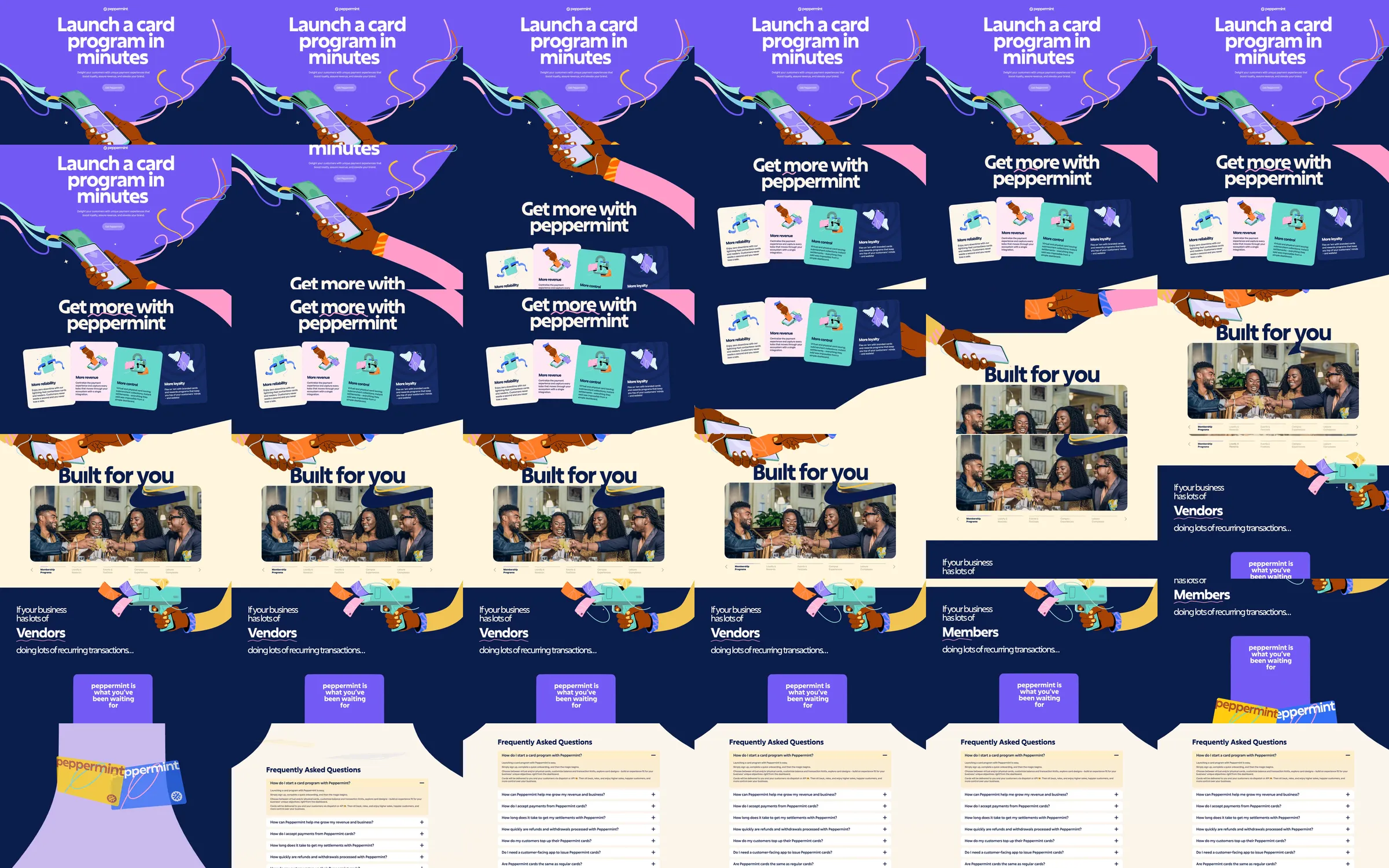
Peppermint uses large white type, cartoon hands, a payment phone and flowing ribbons to explain its card-program platform. Purple, navy and cream sections alternate between expressive artwork, tangible card-shaped benefits and practical audience explanations.
1. Purple headline and illustrated payment scene. 2. Dark benefit-card row. 3. Cream audience collage. 4. Changing audience-category statement. 5. Illustrated closing action. 6. Cream frequently asked questions.
The hand-drawn payment objects make infrastructure feel concrete. Broad color changes establish a reading rhythm, and the smaller illustrated cards organize the benefits into separate, memorable units.
Refero [style page](https://styles.refero.design/style/c03d3f6f-91f9-4571-9840-7fd4da539322) and [recorded video](https://images.refero.design/styles/refero.design/video/3881a535-4cfe-403e-a8e0-70be40a0250a.mp4); [live site](https://paywithpeppermint.com/) checked on 2026-10-05. The recording is a point-in-time reference; current site content may differ. Descriptions distinguish the recording from the current page where they differ. Layout and motion notes come from sampled recording frames and automated live captures; interactive controls were not comprehensively tested. Only the marketing presentation was reviewed; card issuing, settlements and payment transactions were not performed. The audience word changes are visible in the sampled sequence, but their trigger was not measured.