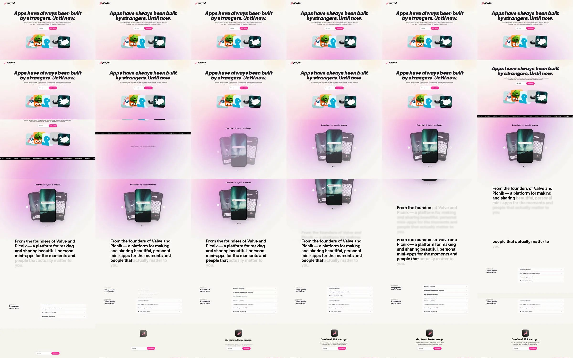
A bold italic statement introduces personal app creation on a warm light surface. Small app icons, a pink-gradient phone composition and a restrained explanation section lead into simple form-like examples and a compact closing.
1. Italic personal-app introduction. 2. Small app-icon row. 3. Pink-gradient phone composition. 4. Product explanation. 5. Example panels. 6. Compact closing.
The italic type and pink accent make the software feel personal rather than enterprise-oriented. Phone examples give the idea a concrete scale while the quiet lower sections retain focus.
Refero [style page](https://styles.refero.design/style/f93ac72e-73b2-4b2c-80eb-351ddfa56f4d) and [recorded video](https://images.refero.design/styles/refero.design/video/90b34001-424a-4ccf-884b-438697eff19c.mp4); [live site](https://playful.software/) checked on 2026-10-05. The recording is a point-in-time reference; current site content may differ. Descriptions distinguish the recording from the current page where they differ. Layout and motion notes come from sampled recording frames and automated live captures; interactive controls were not comprehensively tested. The live opening uses a beach/phone scene and revised arrangement rather than the recorded icon-row opening. No app was created.