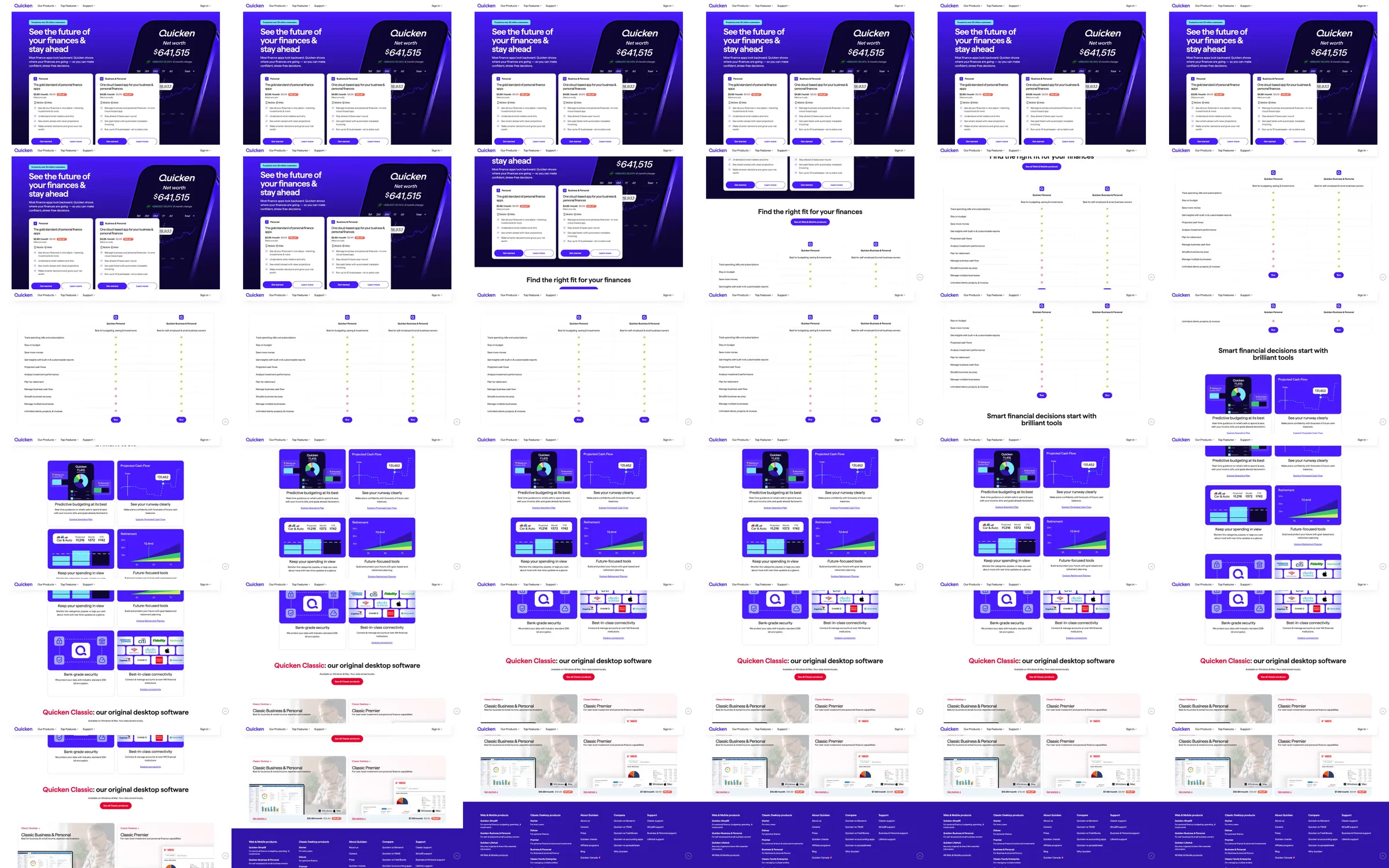
The source uses a violet finance hero with interface cards and a large net-worth readout, then develops into a spacious comparison of product choices. Repeated violet feature tiles show budgeting and money-management benefits, followed by a distinct desktop-software section, advice cards and a deep-purple footer.
1. Violet finance hero and product UI cards. 2. Product-choice comparison. 3. Violet benefit tile grid. 4. Budgeting and money-management detail. 5. Desktop software offer. 6. Editorial advice cards. 7. Closing and dark footer.
Repeating violet panels gives very different finance products a common visual identity. The comparison section translates the broad promise into concrete choices, while smaller advice cards soften the shift from sales information to ongoing help.
Refero [style page](https://styles.refero.design/style/75eb47d6-2526-4936-b15a-7474cf4cdc69) and [recorded video](https://images.refero.design/styles/refero.design/video/6671bbc7-cf3e-4a9c-a7fb-36b8e0fc95d1.mp4); [live site](https://www.quicken.com/) checked on 2026-10-05. The recording is a point-in-time reference; current site content may differ. Descriptions distinguish the recording from the current page where they differ. Layout and motion notes come from sampled recording frames and automated live captures; interactive controls were not comprehensively tested. The live hero has a pale lavender background and an illustrated people-and-finance composition rather than the recorded dark-violet card group.