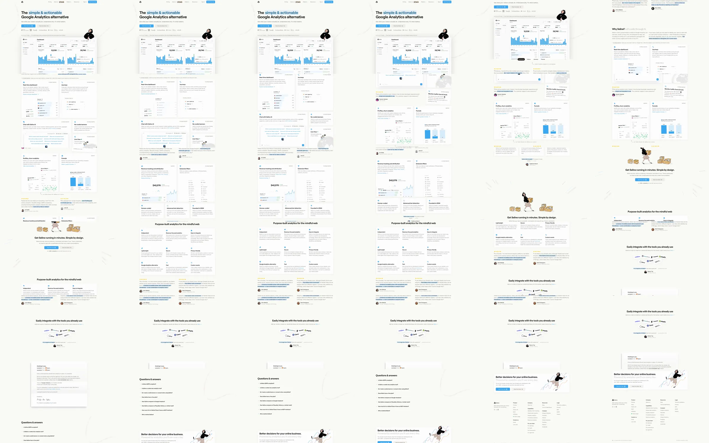
A privacy-first analytics landing page that makes a technical alternative feel small, human, and understandable. Real dashboard views carry the proof while hand-drawn people, highlighted phrases, and conversational testimonials soften the software presentation.
1. Compact navigation and trial action. 2. Outcome-led hero with dashboard overview and customer logos. 3. Customer quotation pair and live product demonstration. 4. Feature grid for visitor monitoring, profiles, funnels, attribution, and filters. 5. Founder-led Why Seline explanation and additional product evidence. 6. Quick setup scene and purpose-built product principles. 7. Integration proof, founder note, FAQ, closing trial panel, and footer.
The page shows the actual product early and repeatedly, then uses annotations and illustrations to direct attention without making the interface feel heavy. Blue highlights create a consistent reading path through a mostly white canvas. The cost is that pale borders and small screenshots can lose clarity on compact displays unless responsive crops and contrast are carefully maintained.
- [Refero style page](https://styles.refero.design/style/7967c6d9-e50c-42b5-b4d1-74003ba41781) and its [recorded MP4](https://images.refero.design/styles/refero.design/video/ac54e960-7d18-45cb-a64b-d31e9991e255.mp4) supply the full dashboard, feature grid, testimonials, setup illustration, principles, integrations, FAQ, and footer sequence. - The submitted live URL https://seline.so/ redirects to the current site at https://seline.com/, which supplies current content, responsive screenshots, and measured layout. - The sources agree closely. Trust the recording for intermediate illustration and reveal states and the live page for current URLs and copy.