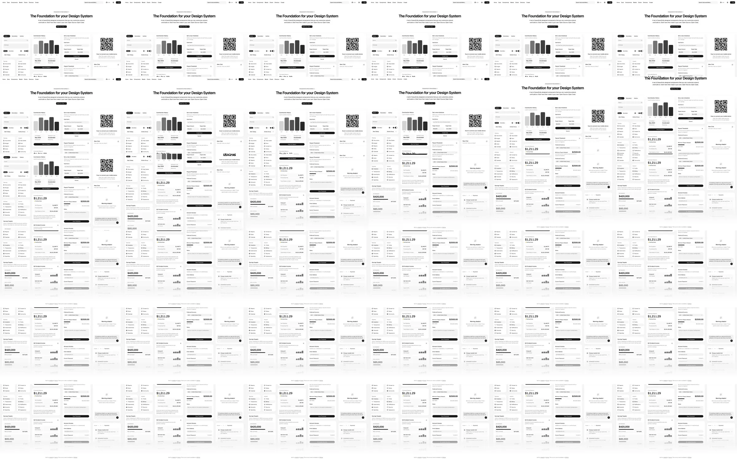
A component-library page that demonstrates the system by showing real interface parts in place.
1. Design-system statement hero. 2. Component example grid. 3. Documentation and customization pathways. 4. Community and get-started links.
The page itself proves the composability claim; the dense gallery can feel like a catalog without clear examples of use.
- [Refero style page](https://styles.refero.design/style/0fd67ec5-7e9c-4ca9-b368-5d9c7388477a) and its [recorded MP4](https://images.refero.design/styles/refero.design/video/1c77eed6-6370-4b5e-88ad-71f13b656afe.mp4) supply the sampled motion and section sequence. - The live page at https://ui.shadcn.com/ was checked for current content, responsive screenshots, and measured layout. - The live site currently shows the same component grid and documentation navigation. Sampled motion is limited.