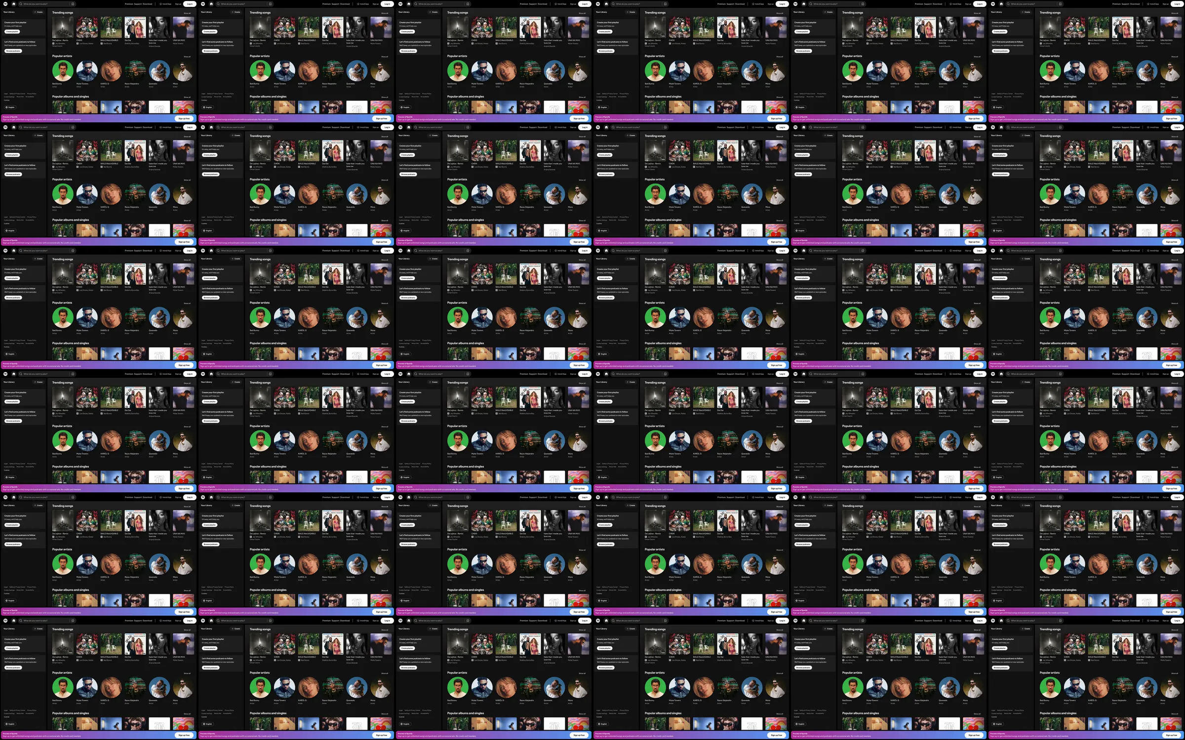
A desktop music-discovery surface organized around a permanent library rail, artist circles, and album tiles.
1. Navigation and library rail. 2. Trending and popular music grid. 3. Artist and album discovery. 4. Signup offer bar.
Persistent navigation and cover-art density make browsing fast; the small labels and repeated cards can be tiring on compact screens.
- [Refero style page](https://styles.refero.design/style/cc59e195-fed0-4928-96d1-303752786073) and its [recorded MP4](https://images.refero.design/styles/refero.design/video/b07c43ce-18c6-4dab-a2cd-d5504bc6b046.mp4) supply the sampled motion and section sequence. - The live page at https://www.spotify.com/ was checked for current content, responsive screenshots, and measured layout. - The live root opens the Spotify web player. The Refero recording is almost static, so no pointer effects or scroll choreography are inferred.