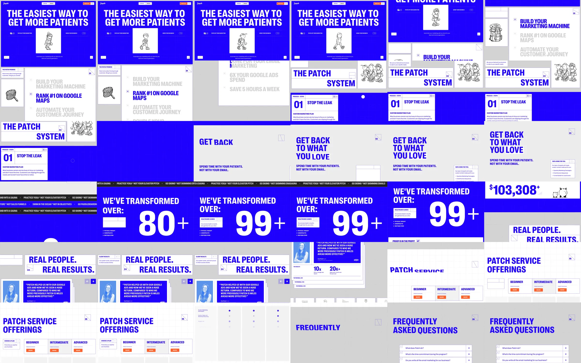
Patch uses electric-blue fields, fine grid lines, oversized uppercase type and hand-drawn figures to introduce its marketing service. Process cards, large proof figures and alternating pale testimonial panels develop the story before service offers and FAQs.
1. Blue grid introduction and cartoon character. 2. Marketing service list. 3. Numbered process steps. 4. Large changing proof figure. 5. Revenue and testimonial panels. 6. Service offer columns. 7. FAQ section.
The blue and pale surfaces give the dense page a strong visual rhythm. Hand-drawn characters soften the heavy typography, while large figures make the transition from process to proof immediately visible.
Refero [style page](https://styles.refero.design/style/7af0134b-c299-42f8-9d95-7004e2d0e278) and [recorded video](https://images.refero.design/styles/refero.design/video/c8f4c739-b52a-40ad-a72b-b76d3813598a.mp4); [live site](https://thepatchsystem.com/) checked on 2026-10-05. The recording is a point-in-time reference; current site content may differ. Descriptions distinguish the recording from the current page where they differ. Layout and motion notes come from sampled recording frames and automated live captures; interactive controls were not comprehensively tested. The live page retains the blue-grid identity. Marketing claims were not independently assessed; booking, AI tools and service inquiries were not operated.