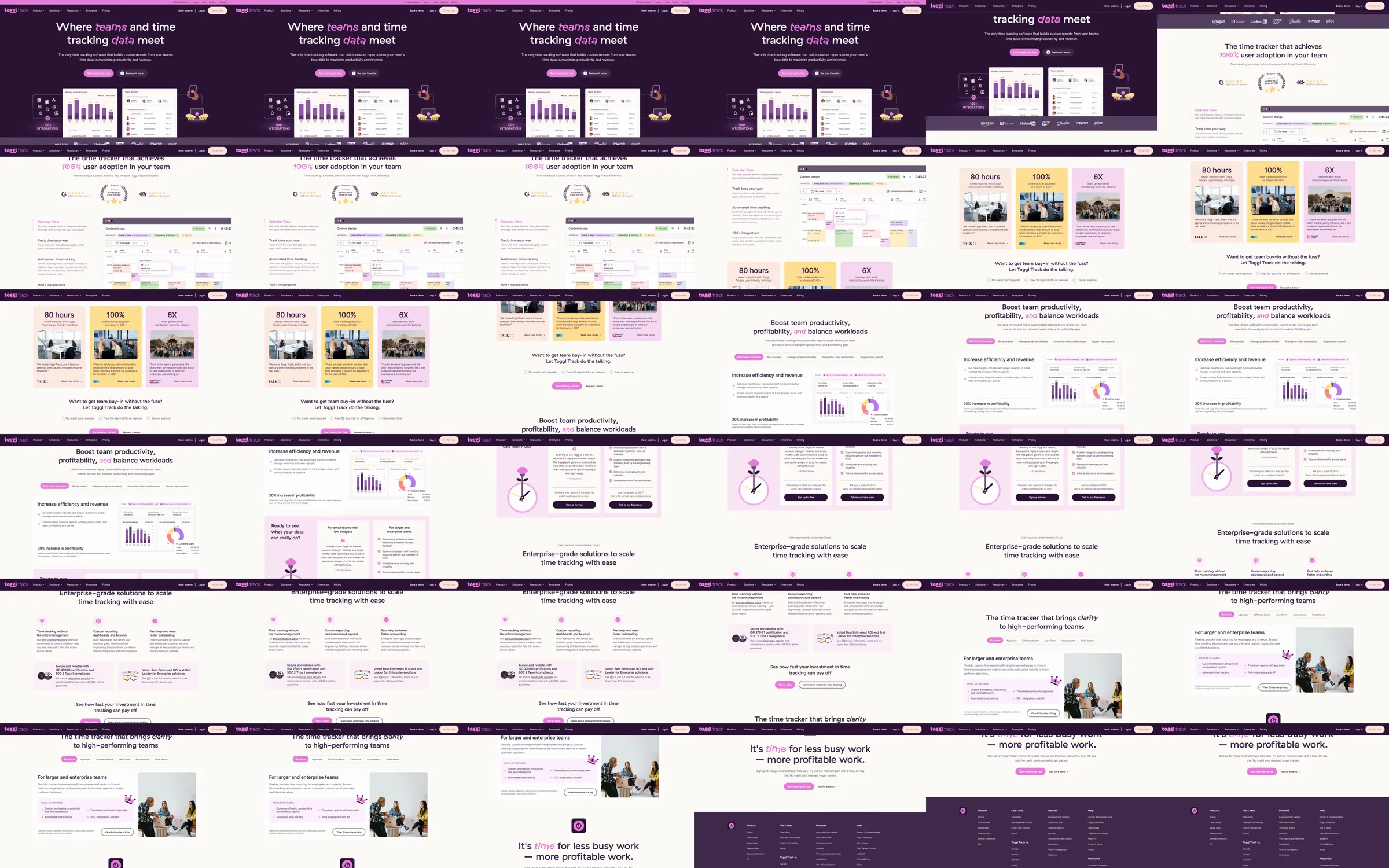
The recorded hero uses deep purple around report screenshots, then turns cream for quantified benefits, side-by-side product explanations and lavender cards. Small charts, timesheet interfaces and customer proof connect the playful color system with practical team and profitability outcomes.
1. Purple time-tracking hero with report UI. 2. Awards and adoption proof. 3. Quantified customer benefits. 4. Report and profitability modules. 5. Pastel feature cards. 6. Enterprise and team solutions. 7. Customer and audience examples. 8. Final invitation and purple footer.
The product screenshots supply immediate evidence of the tool, and the pastel modules divide a long benefits page into easy groups. Dark purple sections act as visual punctuation while the report charts retain consistent styling.
Refero [style page](https://styles.refero.design/style/813be405-c2b9-41be-9864-7b53d66483dc) and [recorded video](https://images.refero.design/styles/refero.design/video/164b57d0-4a71-40d2-85ad-e117bc800331.mp4); [live site](https://toggl.com/) checked on 2026-10-05. The recording is a point-in-time reference; current site content may differ. Descriptions distinguish the recording from the current page where they differ. Layout and motion notes come from sampled recording frames and automated live captures; interactive controls were not comprehensively tested. The live opening now uses a cream background with confetti-like marks rather than the recorded deep-purple hero.