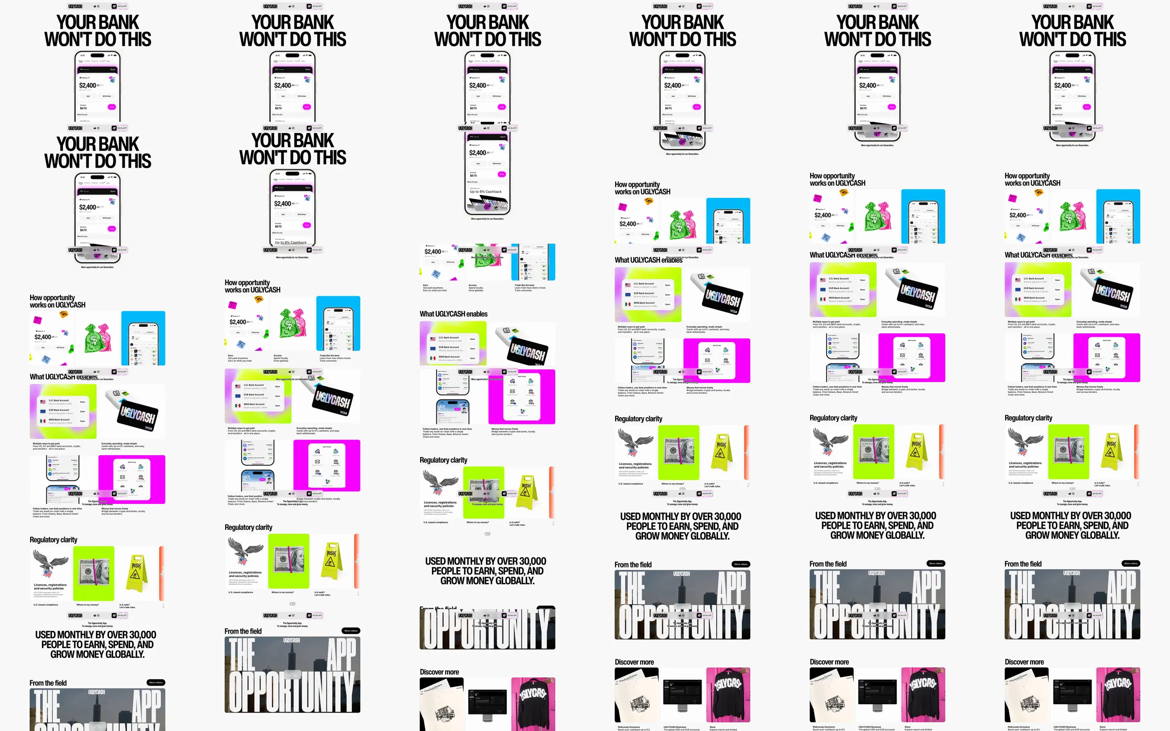
A condensed black headline sits over a central phone demonstration. Neon pink, lime and blue cards explain money flows, balances and product capabilities before large typographic proof and editorial links.
1. Your-bank opening and phone. 2. Opportunity and money-flow explanation. 3. Product capability cards. 4. Regulatory information. 5. Usage proof. 6. Field stories and merchandise.
A monochrome headline gives the page a strong spine; neon tiles distinguish individual capabilities and keep small interface previews recognizable.
Refero [style page](https://styles.refero.design/style/680cf16b-0093-473b-854f-f1de9af5e698) and [recorded video](https://images.refero.design/styles/refero.design/video/3e101fa2-32f8-4e5d-9464-c55788643420.mp4); [live site](https://ugly.cash/) checked on 2026-10-05. The recording is a point-in-time reference; current site content may differ. Descriptions distinguish the recording from the current page where they differ. Layout and motion notes come from sampled recording frames and automated live captures; interactive controls were not comprehensively tested.