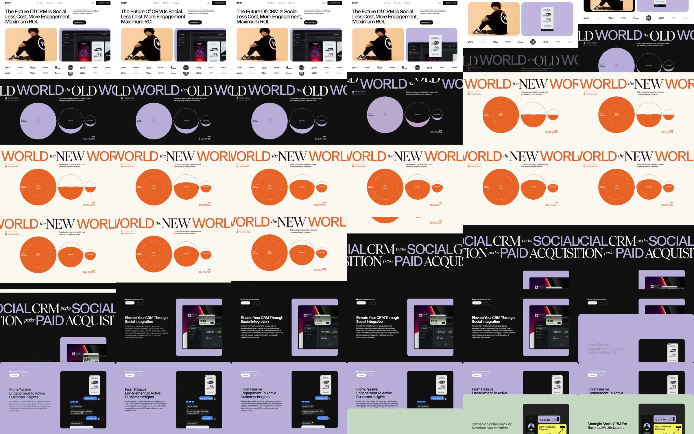
The social-commerce landing begins with a tightly set headline and two rounded interface-demo panels. A black Old World comparison changes into a pale orange New World diagram, then large typographic bands separate alternating black, lavender and sage feature panels.
1. Headline and paired interface demos. 2. Old World comparison. 3. New World comparison. 4. Social CRM and customer-insight panels. 5. Customer brands and results. 6. Closing invitation.
Color changes distinguish competing models and product benefits; large editorial typography makes the transition between ideas visible before the smaller interface detail is read.
Refero [style page](https://styles.refero.design/style/36d939b8-e3b5-45c7-8d81-f7c4d7c8fdaa) and [recorded video](https://images.refero.design/styles/refero.design/video/5d7b9ccc-fff9-43e3-99ee-1fe9c206c483.mp4); [live site](https://www.usedrop.io/) checked on 2026-10-04. The recording is a point-in-time reference; current site content may differ. Descriptions distinguish the recording from the current page where they differ. Layout and motion notes come from sampled recording frames and automated live captures; interactive controls were not comprehensively tested.