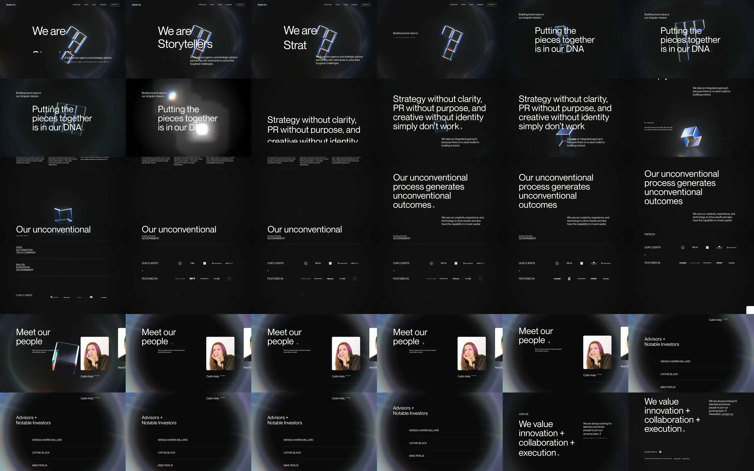
Vivid & Co. introduces a full-service agency and strategic advisor through large, declarative statements instead of a project grid. A black, lightly textured field carries minimal white type, small proof details, and a recurring translucent object whose rainbow edges add movement and depth.
1. Compact header with expertise, work, team, careers, and contact navigation. 2. Hero that introduces Vivid & Co. beside the refractive block assembly. 3. Brand-value statement and a large argument for integrated strategy, PR, and creative identity. 4. Expertise and process sections with sparse text blocks, sector labels, and the moving object. 5. Client and press proof row. 6. Team introduction, people profile, advisor/investor list, and careers close. 7. Contact-led footer.
The interface has the pacing of a short title sequence. Each large statement gets an uncluttered frame, then the page uses small supporting copy and hairline dividers to reset the scale. The glass-like object concentrates the site’s color, so the rest of the layout can stay almost monochrome without feeling flat.
The supplied 36.83-second recording provides the complete desktop sequence, including the changing opening statements, object movement, expertise/process copy, proof row, team profile, advisors, and closing. The live capture at https://vividand.co/ supplies the current desktop and mobile layouts, measured type/tokens, and the page-wide SVG animation evidence. Both sources show the same black editorial direction and prismatic-object treatment.