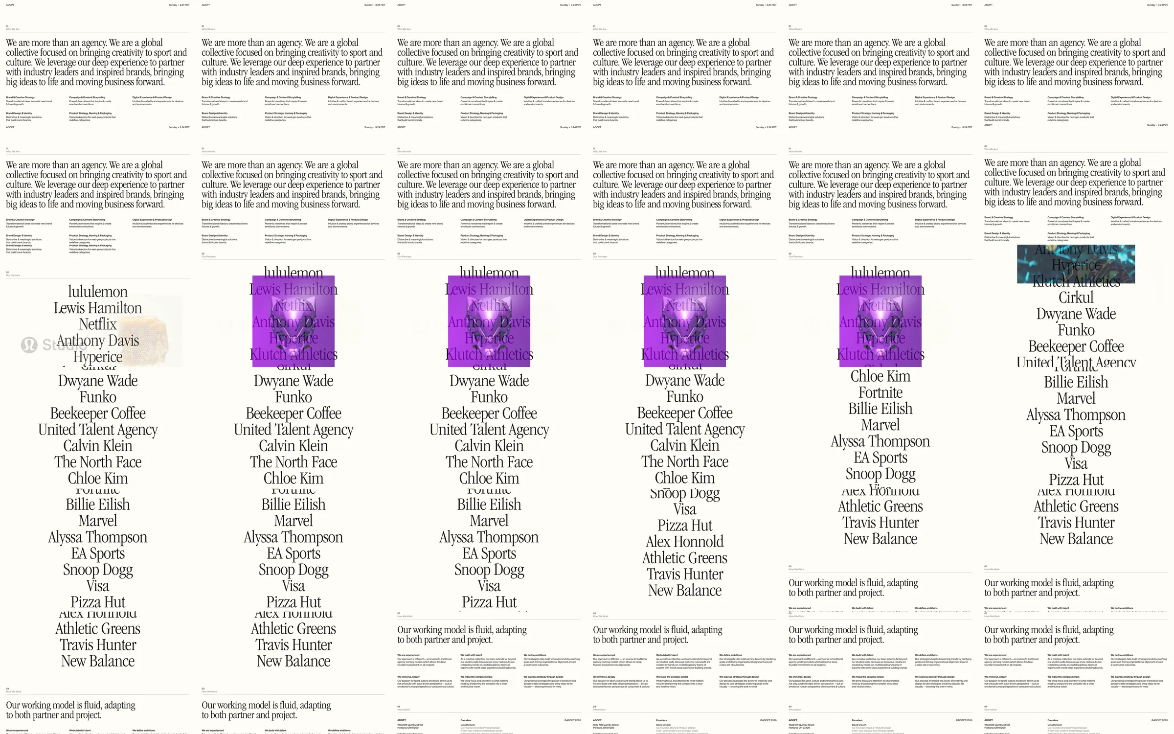
Adopt introduces its sport-and-culture agency through an oversized serif paragraph on cream, followed by small service columns. A tall centered partner-name list becomes the main visual event as colored and photographic project previews overlap selected names.
1. Cream agency statement. 2. Service capability columns. 3. Centered partner-name list. 4. Image-backed partner previews. 5. Working-model explanation. 6. Lower company and contact information.
The large paragraph lets the agency's point of view lead the page. Centering the long partner list turns familiar names into a distinctive composition, and occasional image previews supply visual proof without replacing the typographic emphasis.
Refero [style page](https://styles.refero.design/style/6d360718-91b8-4c74-a6f0-91f4731a6671) and [recorded video](https://images.refero.design/styles/refero.design/video/1dc88f8d-8910-4e06-b028-204e0a4f87e2.mp4); [live site](https://weareadopt.com/) checked on 2026-10-05. The recording is a point-in-time reference; current site content may differ. Descriptions distinguish the recording from the current page where they differ. Layout and motion notes come from sampled recording frames and automated live captures; interactive controls were not comprehensively tested. The current opening retains the cream statement and expands the partner roster. Partner-list previews were observed in the source; pointer tracking, hover mechanics and project navigation were not measured.